5x for all the Pros
Hands-on iPhone 16 Pro review: Two-minute preview
Running from the Apple Keynote to the expansive demo room right behind it, I was confronted by long tables of new products, including iPhone 16 Pro and iPhone 16 Pro Max phones on pedestals (as they should be), and hoards of excited media and analysts who crowded so tightly around the products that I could scarcely get close enough to sniff them.
Lucky for me, many Apple representatives were milling about who would almost surreptitiously remove the gleaming handsets from their pockets and then just as casually walk you through features.
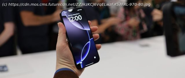
That was how I finally got close to the iPhone 16 Pro, a now 6.3-inch iOS 18 device that is slightly larger than the iPhone 15 Pro while offering noticeably more screen real estate. Apple managed this trick by shrinking the bezel so it’s just a thin dark line surrounding the Super Retina XDR display. Apparently, Apple figured out how to reroute some of the screen traces from the edges to underneath the display, which made the razor-thin bezel possible.
As they handed me the phone, I noticed its Black Titanium body felt just as solid and smooth as before. It felt familiar because the design was largely unchanged from the last iPhone. The one noticeable and significant difference is the new Camera Control. This tactile/haptic combo button, which adorns the full iPhone 16 lineup, is kind of the star of the new iPhone show.
Stuffed full of technology, the button lives below the power button and is used initially to open the camera app. A lighter press activates the haptic response access controls, and a double press accesses a deeper set of camera controls.
After that, you can swipe up and down on the bottom to select different photography features. After a quick training, I could use it to access the different lenses, set exposure, and change the depth of field. There’s a visual cue on the screen to help you keep track of all the touch, tap, and gesture-based camera changes.


