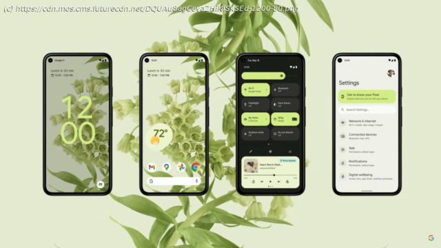
Opinion: While the new Android 12 UI is overdue, has iOS 14 made it irrelevant?
At Google I/O, Android 12 was finally unveiled, with three main focuses — a new user interface, privacy, and, a car key. All great features in their own way, however the UI was an important part here, from being the butt of the jokes of the operating system, now to an attractive showcase that also allows a multitude of customizations. Material You is the new name for this reboot of the UI, superseding Material that’s been present ever since Android Lollipop / version 5.0 almost seven years ago. However, last year Apple released iOS 14, which brought widgets to the forefront of the home screen. But thanks to a certain app and Shortcuts, these allowed themes to be applied to the icons and widgets, making the home screen explicitly unique to you. Android 12 may finally be here with a fresh coat of paint, but I wonder if it’s already too late, especially with other vendors spinning their own theme on the operating system for years now. When Android first arrived in 2008, we were greeted with an appearance that looked like an amalgamation of BlackBerry and iPhone — hurriedly made in order to be a competitor to the recently-launched App Store from Apple. As the years passed by and the operating system became more plentiful in features, the UI was left by the wayside, with Google leaving it to third-party vendors to create their own twist, whether that was Samsung, Sony, OnePlus and many more. The appearance started to look dated, old-fashioned, almost bloated in comparison to iOS, regardless of Google’s focus on more animations that were smooth and.


