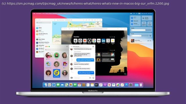
With Big Sur, Apple is adding some iOS-like elements to its desktop operating system, including a new design language and big updates to the Safari web browser.
Just as iPadOS is starting to look more and more like macOS, the newest version of Apple’s desktop operating system, macOS Big Sur, borrows heavily from the California tech giant’s mobile OSes.
One of the biggest reveals from Apple’s virtual Worldwide Developers Conference (WWDC) is the news that Apple will drop Intel CPUs for its own ARM-based Apple Silicon. The effort starts with the A12z, which is being sent to application developers to get their code compatible with the new architecture. But there’s still plenty of news for macOS aside from the new chip.
A new design language makes the Mac interface even slicker—a tall feat—and more consistent with the iPhone and iPad interfaces. Notice, for example, that even the app icons now resemble the square iOS ones rather than the traditional circular macOS ones. The visual updates extend to built-in standby apps including Maps, Mail, Calendar, and Photos. The Safari web browser and Messages app get particular attention, with new features as well as a new look.
SEE ALSO: How to Get iOS 14 Right Now
Even though Apple has pegged its future on Macs running its own CPUs, macOS Big Sur will still support a healthy list of older computers, including MacBook Air, MacBook Pro, and Mac Pro models dating back to 2013. The OS will launch in July, but developers can download a beta now. A public beta will become available in July, and the final release will occur next Fall. New Design Language (Image: Apple)
With Big Sur, Apple gives macOS an updated look, with more translucent, simplified 2D system icons, and controls that light up when you use them. I can’t help thinking that it resembles Microsoft’s Fluent design system, though Apple hasn’t given its new style a name. Rounded corners for windows and dialog boxes are a distinctive part of the new look (something that was rumored to be coming to a Windows 10 update but is a no-show so far). It supports light and dark modes, while the menu bar and menus themselves are now translucent.
Big Sur also updates the OS’s sounds. The Mac startup sound has been unmistakable for over a decade, but the new system sounds have been “remastered and refined,” says Alan Dye, Apple’s VP for Human Interface, while remaining recognizable. Control Center (Image: Apple)
Though Apple added a Notification sidebar before Microsoft did the same with the Windows 10 Action Center, I’m surprised it took so long for macOS to include basic system controls in Notification Center the way Action Center does.


