Apply designer Milton Glaser’s tips to make your presentation memorable and engaging.
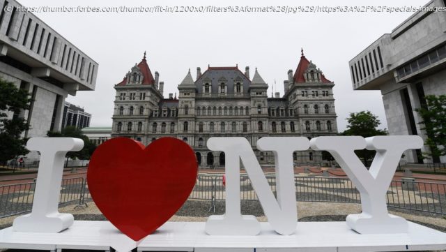
Milton Glaser was a household name among visual designers, but even those who don’t know his name have probably seen a version of his iconic logo:
I (heart) NY
Glaser died on Friday, his 91st birthday.
As a communication specialist, I’ve been intrigued by Glaser’s logo for years. It’s simple and puzzling. In Glaser’s words, it “informs and delights.”
The logo is a powerful reminder that a simple visual can transform the mindset an entire city.
According to Glaser’s interview for a documentary on his work, New York City in the mid-1970s was feeling “a collapse of well-being and morale.” In an effort to reinvigorate the city and its tourism industry, city and state officials asked Glaser to create a visual around the line, “I love New York.”
The new logo created “a shift in the city’s consciousness, from being indifferent to itself to realizing that we love this place.”
Glaser’s logo offers several lessons for any communicator who has an idea to get across. Apply these tips to your next presentation to make it engaging and memorable.
Home
United States
USA — Cinema The I ‘Heart’ NY Logo Designer Used Visual Communication To Inform And...


