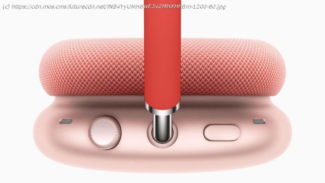
The AirPods Max eschew voguish touch controls in favor of an Apple Watch-style dial.
The AirPods Max are the first Apple over-ear headphones, and they’ve been the subject of speculation for quite some time, with rumors that they would be among the most high-spec headphones ever released. After a year of apparent delays, the Apple AirPods Max were finally announced on December 8 via a press release posted to the Apple newsroom; a surprisingly low-key release considering just how much hype surrounded the wireless headphones. As expected, the AirPods Max have taken the internet by storm, dividing opinion with their unusual design and exorbitant price tag – but many of the rumored specs, including built-in artificial intelligence, head tracking, and clever gesture controls were missing. Most surprising of all was Apple’s decision to eschew voguish touch controls in favor of a rather retro control dial, inspired by the Digital Crown on the Apple Watch. Touch or swipe controls feature on many of the best over-ear headphones you can buy today, including the Sony WH-1000XM4 and the Bose Noise Cancelling Headphones 700 – so why has Apple ditched them in favor of an old school dial? Touch-sensitive headphones have been around for a few years now, and allow users to control their music playback and settings using a series of gestures; for example, tapping the earcup once to pause your music, or swiping up to increase the volume. It’s an increasingly common feature on both over-ear headphones and wireless earbuds, and in some cases, it works very well. In many others however, touch controls are more of a hindrance than a help. First of all, touch controls require the user to memorize a host of different gestures, which can become quite convoluted, especially as headphones are becoming increasingly complex devices. How anyone is supposed to remember three taps to turn off noise cancellation, two taps to skip tracks, a swipe up to change the volume, a long press to summon your voice assistant and so on, is a mystery. Not only that, but swipe and touch controls often don’t work as well as the manufacturer may have intended. There are often issues with sensors picking up the movement of your finger, or an annoying lag between your gesture and the resulting action. Apple, with a design aesthetic that focuses on simplicity and user friendliness, seems to have realized the technology’s current shortcomings. The tech giant has always been reticent when it comes to implementing very new technology in its devices, often waiting for other manufacturers to try out new features and jumping in when it’s matured.
Home
United States
USA — IT The Apple AirPods Max prove touch controls aren’t good enough on headphones…...


