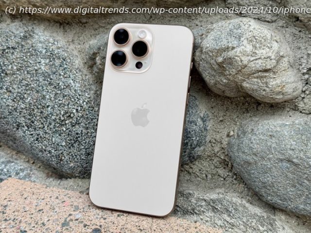
The iPhone 16 Pro Max is big, powerful, and expensive. If you can handle its size and price, it’s a fantastic iPhone.
Apple’s iPhone 16 series is now available for everyone. There are four models in the lineup: the iPhone 16, iPhone 16 Plus, iPhone 16 Pro, and iPhone 16 Pro Max. All of these have the latest chips, an Action button, and Camera Control.
Personally, I’ve had every generation of iPhone since 2008, and when given the option, I tend to go for the smaller device. But this year, I got the iPhone 16 Pro Max to check out, and I have a love-hate relationship with it because of the size.
But looking beyond that fact, this is a fantastic iPhone and a worthy upgrade if you are coming from an older model.iPhone 16 Pro Max: specsiPhone 16 Pro Max: design
While the base model iPhone 16 got a pretty modest redesign with the camera layout, the iPhone 16 Pro models look pretty much the same as last year, and the year before that.
Apple is still using the titanium frame with a brushed metal finish, flat edges, a matte glass back, and the Action button on the left-hand side, above the volume buttons. The triple-lens camera layout is also the same as before. The “latest generation” Ceramic Shield is on the front display, making it resistant to impact and scratches. In fact, if you look at an iPhone 15 Pro Max and an iPhone 16 Pro Max next to each other, you wouldn’t even be able to discern a difference at first.
That is, until you look toward the bottom on the right edge of the frame. That’s where Apple has put in the new Camera Control button, which sits flush with the frame, rather than sticking out a bit like the other buttons. There’s a few things that you can do with the Camera Control, which I’ll get to in a moment, but that’s basically the key differentiator between the iPhone 16 Pro Max (and the rest of the iPhone 16 line) and previous generations.
The iPhone 16 Pro Max retains Apple’s overall design from the last several years — whether you love it or hate it, Apple seems to be sticking with the “if it ain’t broke, don’t fix it” motto.
It’s a tried and true design, for sure, but I have to admit that it’s growing a bit stale. I would have liked to see some changes made to the Pro models this year like Apple did with the base model iPhone 16.
The iPhone 16 Pro models also come in four rather uninspired shades: Black Titanium, White Titanium, Natural Titanium, and Desert Titanium. Seeing the incredibly saturated colors of the base model iPhone 16, the colors Apple chose for the Pro models are pretty dull. Desert Titanium isn’t as bad as I originally thought it would be, but it’s still not my personal preference of color.iPhone 16 Pro Max: Camera Control
Now, let’s talk about the biggest new feature on the iPhone 16 hardware this year, including the iPhone 16 Pro Max: Camera Control. The Camera Control sits below the halfway point on the right edge of the frame, underneath the sleep/wake button.
I’ll be honest here: I don’t particularly like where Camera Control is located. As I’ve been using the phone, I often end up pressing the Camera Control unintentionally, and its current position requires me to adjust the way I hold the phone when taking landscape photos. The default pressure sensitivity for actually pressing the button is also set a bit too high for my liking, which can cause camera shake when capturing a photo.
I feel like Apple should have moved the Camera Control down a bit, closer to the bottom, as that would have felt more natural when taking landscape photos, similar to a digital camera.
One press of the Camera Control launches the Camera (or another app that supports it), and another press captures a photo, while a press and hold starts a video recording. You can also do a double half-press to switch between various camera settings, and slide your finger on Camera Control to make adjustments.
Placement aside, I really like the Camera Control feature. I’ve been wanting a dedicated shutter button for the iPhone for a while, since Apple had one on its Smart Battery Case back in the day. With Camera Control now opening up the Camera app, I can remap my Action button to something else.
I’ve often been using Camera Control to launch the camera, but adjusting the settings via Camera Control have a bit of a learning curve, which I’m still adjusting to. After years of using the touchscreen controls to take my photos and video, it’s a very hard habit to break. And unless I use Camera Control with both hands, I don’t like the fact that pressing it to capture can cause camera shake, which is not the best, especially for low-light scenes.


