The Series 9 barely feels any different from its predecessor, but it’s still an excellent smartwatch.
Expert’s RatingPros
Beautiful timeless design
Superb battery lifeCons
Design has barely changed in years
Disruptive interface changes in watchOS 10Our Verdict
The Apple Watch Series 9 is just like the Series 8 but improves on it in a few small ways: the processor is faster, battery life is considerably better, the screen is brighter, and you get the new double tap feature. Almost by default, the Series 9 wins the title of the best general-purpose smartwatch Apple has ever made.
Best Prices Today: Apple Watch Series 9
It’s probably fair to say that the Apple Watch is not prone to radical change. In the eight years and nine standard generations since the first model launched in 2015, the fundamental design has barely altered, and it’s often difficult to differentiate one generation from another. One day, perhaps, this will change. But not today.
The Apple Watch Series 9, launched in fall 2023, doesn’t mess with the formula that has seen Apple effortlessly dominate the smartwatch market for the best part of a decade, and differs from last year’s Series 8 in only a few respects. But does that mean it’s a bad watch? Of course not! Aside from the Apple Watch Ultra line, which is aimed at a different audience, this is the best smartwatch Apple has ever made, as this in-depth review will explain.Design & build
Physical identical to Series 8
But remains a classic minimalist design
Attractive and comfortable on the wrist
Series 8 owners should look away now because very little has changed in this department. That isn’t the greatest of tragedies, of course, since the Series 8 was already a beautifully designed little object.
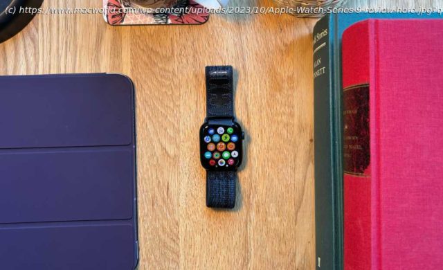
Like its predecessors, the Series 9 is a neat, organic-feeling squircle with pleasing curved edges and corners that sits unobtrusively on your wrist; unlike the Apple Watch Ultra, it very rarely gets caught on a sleeve and has never struck me as bulky. There’s a convex bulge on the underside of the watch, which is where the optical sensor presses into your wrist. This looks like it might be uncomfortable but really isn’t. (Although I occasionally worry that long-term use is creating a little divot in my skin, which is probably a sign I should wear it more loosely than I do at present.)
There’s a minimalist charm to the design, with just two hardware controls, a dial on the right and a button below this, and the button is so seamlessly integrated that it’s almost invisible. This isn’t a problem, of course, since you locate it by touch. The entire design, indeed, feels like an attempt to turn the watch into an invisible envelope for the screen, which is large and bright; outside of this frame, the matte-finish casing draws almost no attention to itself, which is how it should be.
The Digital Crown dial, which is the showiest element of the case thanks to its (still pretty subtle) red circle marking, has a beautifully smooth action whether you’re rotating or pressing it. Apple is so good at these kinds of small but important details.Screen quality
Clear and colorful screen
Twice as bright as the previous model
In most respects, the Series 9’s screen is the same as the one in the Series 9. Again, that doesn’t need to matter very much if you’re thinking of upgrading from an older model (or if this would be your first Apple Watch) but it feels worth mentioning just for the principle of the thing.
The size of the screen you get will depend on which version of the Series 9 you go for. The larger (45mm) model has a 1.9-inch screen with a resolution of 484 x 396; the 41mm edition has a 1.69-inch (430 x 352) screen. Either way, it’s a sharp, colorful display; even when zooming in hard on a photo, and peering very closely at the screen, I was unable to detect any pixelation or fuzziness. It just feels like a window into a digital world. It never feels like you’re looking at a screen, just interacting with your apps.
Like the iPhone 15 and 15 Plus, however, the Apple Watch gets a bump in screen brightness this year. Last year’s Series 8 was capped at 1,000 nits, but the Series 9 goes up to 2,000. (Note that the Ultra line is one step ahead, having already hit 2,000 nits last year and jumping to 3,000 this time around.) In theory, this should mean better legibility outdoors, particularly when the conditions are bright–a common use case for the Apple Watch in its guise as a fitness companion. But I can’t say I really noticed the difference. In a good way, I guess, in the sense that I didn’t find the brightness of the Series 8 an issue.
At the other end of the scale, Apple says the Series 9 can get dimmer than previous models: it goes all the way down to 1 nit when you don’t want to disturb anyone or just want to preserve battery life. Mind you, Apple didn’t announce the minimum brightness of the Series 8, so it’s hard to judge how much things have changed… but some analysts have suggested it might have been capable of dropping to 2 nits and no lower. This doesn’t sound like much of a difference but it has an impact on battery performance as you’ll see below.Performance: Paper gains
Features S9, fastest ever Apple Watch processor
Performance gains not yet apparent in real-world testing
Apple spent a fair bit of its launch presentation talking about the processor in the Apple Watch Series 9, which is called the S9. For the first time in years, we get a noticeable bump in processing power; the S8 and S7 in previous generations were essentially rebranded editions of the S6 in the Apple Watch Series 6 from 2020.


