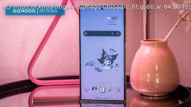
The titanium pulls everything together, but Galaxy AI’s tricks are only a treat if you keep it simple.
The Samsung Galaxy S24 Ultra is big, beautiful, and a heck-of-a-lot-of smartphone. It is the best of everything Android can do, as it can do more than the Google Pixel 8 Pro—it has a built-in stylus. But the real kicker of this year’s Ultra release is its titanium finish, which pulls together the whole look of its “ultimate” aesthetic.
No smartphone is perfect, of course, and after a little over a week with the Galaxy S24 Ultra, I am starting to get irked by some of the Ultra’s quirks. For one, it’s still a ginormous smartphone—though, to be fair, it descended from the same model that brought you the “phablet.” Still, it will overpower people with my sized hands. The full titanium backing also gets a little warm on long streaming sessions, which might explain why Apple didn’t go full titanium for the iPhone 15 Pro.
It’s also about $100 more this generation, starting at $1,300 for the 256GB storage version. The good news is that there have been some improvements to this year’s Ultra. But besides the titanium, which we’re all still dubious about its overall durability, the Galaxy S24 Ultra’s best new features are primarily within the software realm. You don’t need Samsung’s latest and greatest hardware to access that.
I’m digging the titanium aesthetic that’s taking over premium smartphones. Apple started the trend with the iPhone 15 Pro/Pro Max, and now Samsung is carrying the torch for the Android-wielders of the world. As a result, the Galaxy S24 Ultra is most certainly in a class of its own. It has its own unique colorways, like Titanium Violet and Yellow. Samsung offered Titanium Gray to Gizmodo for review. The only parts of the Ultra’s frame that aren’t titanium are the volume rocker and power button.
As I mentioned, the Galaxy S24 Ultra can get warm if you stream an app like YouTube TV. At one point, I clocked about a 20-degree difference between the top and bottom of the device, though it was fine while watching apps like Pluto TV and Frndly TV. I’ve contacted Samsung to ask why that app might have been causing the heat disparity and will report when I hear back. I’ve also called in some cases to see if it exacerbates the toastiness.
There isn’t much difference in heft or weight distribution from last year’s Galaxy S23 Ultra—at least nothing discernably so. If you’re not used to this much slab of a smartphone on you at all times, it will be a lifestyle change. Compared to the iPhone 15 Pro Max and Google Pixel 8 Pro, it’s about an ounce more dense in weight. The Ultra is the biggest smartphone you can get without bringing home a tablet.
At the very least, the S24 Ultra feels easier to cradle because of its angular edges. I’m happy to see that Samsung has finally ditched the curves. I didn’t care for them on the Edge variants from the 2010s. Those same curves made the Galaxy S22 Ultra feel like an unfinished device.
Samsung continues to offer IP68-rated water and dust resistance for its flagship devices. Yes, I do take the smartphone into the shower. Isn’t it nice that I don’t have to bathe with my intrusive thoughts?
Samsung made two minor improvements to the Galaxy S24 Ultra’s screen this year. Like last year’s S23 Ultra, it’s a 6.8-inch Quad HD+ Dynamic AMOLED display with a refresh rate of up to 120Hz. But the screen is now matte-like compared to the shiny exterior of the past two generations of Ultras—no more mirror effect for checking your lipstick.
The S24 Ultra’s display also has a peak brightness of 2600 nits, up from last year’s 1750 nits, surpassing the iPhone 15 Pro and the Pixel 8 Pro’s peak brightness offerings. For some reason, all these smartphone manufacturers began competing for the screen with the most clarity in direct sunlight.
Home
United States
USA — software Samsung Galaxy S24 Ultra Review: Almost Everything You Could Want in a...


