Too many steps make the phone feel slower
What I hate most about smartphones is Settings. It’s hard to organize a Settings menu, and today’s phones prove that. Even the best phones have terrible Settings, and because it’s such a challenge, I like to make Settings the focus of my argument to explain how Samsung’s OneUI software has gotten so terrible, and why Apple’s iOS is better. Buckle up, because I’m opening Settings, and it’s about to get ugly because Settings are bad everywhere, but especially on a Samsung phone.
What’s the best I can expect from a Settings menu? Nothing. Really. I hope to never use Settings. On an ideal smartphone, Settings wouldn’t exist. The AI revolution in smartphones is leading to this point. Eventually, AI is going to manage Settings. You’ll tell the AI what you need, and it will make the adjustments.
To that end, Samsung could end up with the BEST Settings on any smartphone. Bixby, Samsung’s much-maligned digital assistant, is built to manage Settings. Most of what you want to do with your Galaxy phone, and what I’ll complain about below, can be simplified using Bixby.
Hold down the Bixby button and ask your phone to “turn on the Wi-Fi hotspot” or “change the screen mode to Vivid” and Bixby will do it. Bixby knows Settings better than any human. That’s part of the problem. The Galaxy’s Settings are so complicated they need to put an AI in charge.What I want from Settings is as little as possible
Back to what I want: the least effort possible. I don’t want to use Settings, so the more time I spend with Settings open, the bigger the fail.
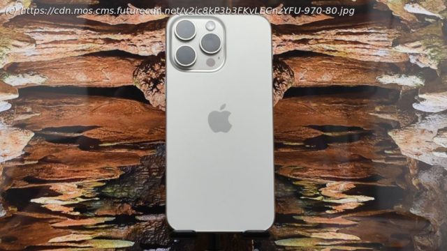
The most common Settings on a phone should be available with one swipe. On my iPhone 15, I swipe down from the upper-right corner of the screen, and I get instant access to not just brightness and Wi-Fi, but also I can quickly tap Do Not Disturb, activate Power Saving, open my AppleTV remote, or even create a new reminder.
Home
United States
USA — software Need proof that Samsung's Galaxy software is worse than the iPhone? Here...


