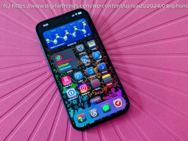
I was eager for these two features in iOS 18, but so far, they’ve just been headache-inducing.
Apple finally released iOS 18 to the public on September 16 after months of betas. It’s one of the biggest iOS updates in history, ushering in a new age of Apple Intelligence, more customization, RCS support, a new Photos app, and a lot more.
I didn’t use the iOS 18 betas, so the public release is the first time I’ve tried out all of the new features, minus Apple Intelligence (it’s coming in iOS 18.1 next month).
Though I’m excited to finally have the next major iOS update, I also can’t believe how bad some of the features I’ve been waiting months for actually are. Let me explain.Messy home screen customization
One of the things I love about Android software is that it is highly customizable, especially the home screen. You can place apps and widgets anywhere you want without fuss.
After many years, Apple has finally added that kind of customization to the iOS home screen. With iOS 18, we can place our app icons and widgets anywhere on the home screen grid, and we can even change our Control Center layouts.
Except there’s a problem: it’s like iOS is fighting me every single time I try to make a change. It feels so very un-Apple-like in terms of how the whole experience has been the opposite of seamless.
Since iOS 14 let us change our app icons without jailbreak by using Shortcuts, I’ve had the same home screen for the past few years.


