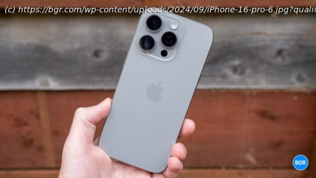
The iPhone 16 Pro and iPhone 16 Pro Max certainly bring improvements — but just how many, and is it worth the update?
It’s a big year for Apple. The iPhone 16 and iPhone 16 Plus are massively improved, thanks to the addition of a series of new features and better performance. But the iPhone 16 Pro and iPhone 16 Pro Max get some updates too. For starters, they offer the highly publicized new Camera Control feature, along with an improved chip in the form of the A18 Pro and some design tweaks that help them feel even more premium.
But are those changes really enough? It seems as though in previous years, pro model iPhones have gotten bigger upgrades. That’s not to mention the fact that this year, the biggest iPhone feature of all is Apple Intelligence, and it’s a feature that isn’t available on the new iPhones at launch.
That’s not to say that the iPhone 16 Pro and iPhone 16 Pro Max are unimpressive devices. On the contrary, they’re stunning phones with some of the best performance and best cameras. But this year, it seems a little harder to justify the higher price of the Pro models over the far improved standard iPhone 16 and iPhone 16 Plus.
So who should buy the iPhone 16 Pro or iPhone 16 Pro Max? I set out to find out.iPhone 16 Pro specsThe same sleek design, with one extra button
The general design of the iPhone 16 Pro and iPhone 16 Pro Max remains unchanged from last year. That’s not a bad thing. These are some of the most premium-feeling phones out there, and last year, I really liked the switch to titanium for the frame. The devices feel solid and well-built, and the Desert Titanium iPhone 16 Pro Max that I have is absolutely stunning. I do wish Apple would stop being so stubborn about the colors on the Pro devices, though. I like the cool new colors of the standard iPhone 16 models, and I don’t see why so-called pro iPhones can’t have fun colors, too.
Apart from the Camera Control, which we’ll get into later, perhaps the biggest design change for this year comes in the form of the larger displays. Originally, it seemed that those larger displays came about through smaller bezels, but on the contrary, Apple has made the phones themselves bigger.
The result? While I used the iPhone 15 Pro Max for a year, the iPhone 16 Pro Max just feels a little too big. It’s entirely possible that I’d get used to it over a few weeks of testing it, but outside of using the iPhone 16 Pro Max for review, I’ll probably be sticking with the standard iPhone 16 Pro. It helps that, unlike in previous years, I don’t lose any features by doing so.
Everything else about the design of the phone is more or less what you would expect. You get the volume buttons and Action Button in the same spot on the left edge of the phone, along with the power button on the right edge. The USB-C port is on the bottom.Camera Control
The Camera Control is the biggest change to design change for this year, and it’s a feature that I quite like. It’s very nerdy, which is uncharacteristic of Apple, but characteristic of Apple is the fact that it doesn’t have to be nerdy if you don’t want it to be. Most users who don’t want to tweak camera settings can simply press the Action Button to open the camera and press it again to take a photo.
Of course, it’s also much more advanced than that. You can lightly press the Camera Control to access settings like zoom, exposure, and more. It’s easy to do so, and I found it relatively easy to swipe, though perhaps not quite as easy as simply using the on-screen controls.
Apple’s hands seem a little tied when it comes to the positioning of the Camera Control, though. The feature is a little too high up the side when shooting horizontally, which means that you can’t really curve your finger around the edge to control it, instead having to hold the phone between your fingers and thumb. And it seems a little too low when shooting vertically. You have to bend your thumb in a way that you normally wouldn’t. You do get used to the positioning of it, though, including how to hold the phone when using it.
Perhaps the biggest issue of the Camera Control, however, is how hard you have to press it to actually take a photo. Now, this wouldn’t be that big of an issue if it didn’t result in the phone moving when you pressed the button, essentially reframing your shot.


