Here is a review of the Motorola Edge+. It’s a fantastic phone with a nice display and a powerful processor.
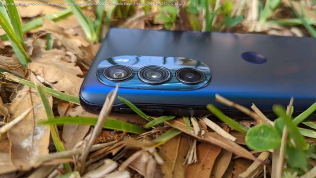
Motorola has been in a weird place with its flagship phones lately. Last year, the company only gave us mid-range handsets. Now, in 2022, the company is back on the horse with its flagship phones, and it delivered its next premium offerings with the new Motorola Edge duo of phones. I was able to review the more premium sibling of the two. How does this phone compete with the competition from Google, Apple, and Samsung? Let’s take a look in this review of the Motorola Edge+.2020’s Motorola Edge was unique in that it had an extremely curved display.2022’s Motorola Edge+ brought that curve to the back of the phone. The back of the phone is covered in a slab of frosted glass that plays beautifully with light. It’s really a sight to behold. It doesn’t pick up fingerprints too easily, as well. Another pleasing detail has to do with the camera module. It’s shaped so that the top and bottom of the module are raised ever so slightly. When the flashlight is turned on, it illuminates the glass, and that makes for a nice effect. One thing to note is the fact that the glass is rather slippery. While the glass looks like it’s textured, it’s perfectly smooth, and that means that the phone is very prone to slipping about. This is only amplified by the fact that the power and volume buttons are so high on the phone. Be prepared for some serious hand gymnastics. Overall, the Motorola Edge+ is a really nice-looking phone, but it falls into the same trap as a lot of the other premium smartphones: it’s really pretty but really cumbersome to hold and operate. I’m going to say the age-old line “You might want to get a case”. One of the main aspects of this phone, I’d say, is the display. The Motorola Edge+ has a large 6.7-inch POLED display, and it gets plenty bright in direct sunlight. I had zero trouble reading the screen while outside in the sun. If you have the color profile set to vibrant, you’ll get those punchy and saturated colors you’d expect from an OLED display. One bummer is that there aren’t any options to finetune the color profile. Another pleasing thing about the display is the 144Hz refresh rate. Nowadays, most flagship phones come with a 120Hz display, and only the gaming phones push it to 144Hz. What makes the refresh rate better is the fact that you can adjust it. In the display menu, you can choose between having it at 144Hz and 60Hz. You can also have the system automatically choose the refresh rate based on the apps you’re using. The only real downside about this display is the resolution. Those of you who are sticklers about how many pixels are packed into every square inch of the display, you’ll be disappointed to know that it’s a 1080+ display. The resolution is 2400 x 1080. That should be enough for most scenarios, but those who are used to 1440p displays may notice a drop in sharpness. All in all, the display is a gorgeous panel. It’s not as high-quality as a Samsung panel, but it makes for a great viewing experience regardless. The Motola Edge+ is rocking a set of dual speakers, and the listening experience is good in most cases and great in some. I listened to different genres of music including rock, classical, film scores, and pop with this phone and I compared it with my Pixel 6’s speakers. Overall, the Edge+ was really good at producing really punchy bass. In sections where the bass was centerstage, this phone’s speakers shined. I found that the speakers did better with 80’s pop and action film scores. They’re able to bring a lot of power.


