 The year 2016 is when the United States sold its soul to Donald Trump and I signed over mine to Apple. How’s that for introduction to the five favs series, joining colleagues Alan Buckingham , Brian Fagioli , and Wayne Williams? Yup. I’m an Apple whore as 2017 opens onto its second day. The fruit-logo company won back my business as I gave up the Google lifestyle. Three main reasons: 1) I believed CEO Tim Cook’s privacy promises, all while my concerns about Big G information collection increased. 2) I found the visual acuity of Apple fonts and user interfaces to be far superior to Google’s, which helped compensate for diminishing reading vision (later recovered through eye surgery). 3) Google’s platforms proved inadequate for easily recording, producing, and publishing the Frak That! podcast (a fun side project).
My contribution to the series is a bit disingenuous, though. I wouldn’t call these «My favorite tech items of 2016». They are what I bought, or was released, last year that I use most often, regardless of their benefits and flaws. Each will get belated review sometime during the next few months. Consider this story each’s preview. Okay, let’s get to them.
15.4-inch MacBook Pro with Touch Bar
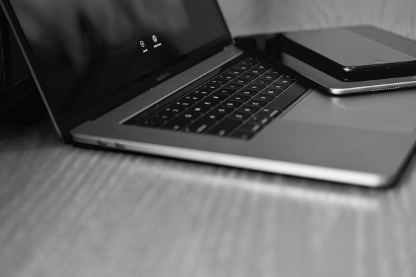
If ever there was a flawed product to plunk down $3,000 (after tax), Apple’s newest notebook is it. I have never spent so much on a laptop than the larger MBP, which I bought from a local Apple Store in late November. The screen is among the brightest (500 nit) and color gamut range and accuracy are best of class. The second-generation butterfly keyboard and accompanying, expansive trackpad improve my writing and overall interaction with the laptop. I primarily chose the computer for these two benefits, and it satisfies. Immensely.
But looked at differently, a touchscreen, rather than the Touch Bar, could be more useful. The strip’s utility is questionable and demonstrates risky design emphasis. Many early buyers complain about shorter-than-expected battery life ; you can be sure more people would take longer charge time over newfangled Touch Bar. The point: Some of Apple’s design priorities need to be reevaluated.
The touchscreen operates in the plane of the eyes, while the other assumes plane of the fingers matters more. Until, and quite honestly if , there is broad third-party developer support, Touch Bar is too much a feature without purpose. Whether or not Apple chose the right plane—fingers over eyes—is a story to be told. The company’s heritage is exceptional: Providing products and user interfaces that people don’t know they need. It’s too early to say if Touch Bar does just that.
I like how the laptop looks; it’s pretty, but arguably pricey. The speakers produce excellent sound, and I find the fingerprint reader to be hugely useful for turning on the computer or authenticating some online purchases. Minimalism in design marries maximal utility.
iPhone 7 Plus
There is something sweet about Apple’s freshest fruits: They imbue the understated design ethic that I wrote about in February 2005. They are visual masterpieces. Works of art, which subtleties charm. My 128GB iPhone 7 Plus in matte black is example. The device feels fantastic to hold, and its appearance pleases my eyes. I can say the same about the new MacBook Pro, which thinness and refinement make older models immediately look outdated. The one is modern, and the other archaic.
What distinguishes Apple in Cook’s kitchen: Product design as refining art. This ethic won’t be appreciated by customers, developers, or investors demanding the next «one more thing» product. But innovation can be subtle, too, and perhaps that’s where it’s best. Understated. Unobvious.


