Google has a brand new 2-in-1 device, the Pixel Slate. Using Chrome OS and a spiffy form factor, it wants to be both a laptop replacement and a proper tablet. But due to some clunky software and odd decisions, the Pixel Slate will have a hard time living up to strong competitors like the iPad Pro or Surface Pro 6.
Google has been in the tablet game for a long time, but hasn’t had much success. Remember the Nexus 9 or Pixel-C? Yeah, not many people do.
The Pixel Slate is Google’s newest attempt. With Chrome OS becoming more robust by the day, it feels like the right time for the company to give it another shot. While there is promise in what Google has crafted, its shortcomings leave us worried, too.
The Pixel Slate takes inspiration from competitors like the iPad Pro and Surface Pro 6. Its form factor is most like the Surface products, a tablet with a full desktop operating system and a removable keyboard.
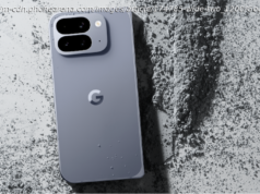
Of those devices, the Pixel Slate is the least exciting. Its aluminum shell is solid, but it lacks the distinctive stylings of the Pixelbook. The two-tone aesthetic has been replaced by a simple, blue chassis that doesn’t look unique. Google has embraced a minimalist aesthetic lately and it generally works, but this is too far.
It does feel great to hold. At 1.6 pounds, it’s not the lightest tablet in the world, but remember it has a 12.3-inch display – larger than the more typical 10-inch tablet. The Pixel Slate doesn’t feel dense. It’s also well balanced. By placing the heaviest components in the center of the device, the Pixel Slate is easy to hold and rarely feels like it wants to leap from your grip.
We saw someone balance the device on the end of their finger. It’s more than just a party trick. The weight distribution makes one-hand use comfortable, which is impressive on a 12.3-inch device. That’s not something we can say about the Surface Pro 6.
The 12.3-inch display looks fantastic, with a higher pixel density than the iPad Pro. It’s big, bright, and colorful, all of which are crucial for a device that is essentially just a large screen. We wished the bezels around the edges of the display had been cut back a bit more, which would’ve made the Slate feel modern.
The computing experience is solid. The more expensive configurations include up to 16GB of RAM and up to an 8th-gen Amber Lake Core i7. That’s a Y-Series processor for those keeping track at home, which is a fanless, dual-core CPU designed for thin devices. That means it’ll trot behind the Surface Pro 6, which offers quad-core Intel hardware.
The desktop experience is heightened by two USB-C ports, which can power multiple high-resolution monitors while charging the device. While we’d like to bemoan the lack of a headphone jack, it’s not too surprising to see the old port removed on a device like this.
The Pixel Slate Keyboard is like Apple’s Smart Keyboard. It folds to hold the tablet in different positions, but it also features a full-size keyboard and touchpad like the Microsoft Type Cover. The tablet slides into the magnet lock and feels stable to tap. The folio case features a simple, smooth way of adjusting the angle of the screen — just push on the back or forward on the folio’s makeshift kickstand. It makes the overengineered hinges found in some 2-in-1s seem downright silly.
The typing experience could be better. The low-travel keys have a harsh bottoming action, even compared to something like the MacBook Pro. The round key design isn’t our favorite, either, though they are backlit and have a familiar layout. One positive here is the touchpad, which is large and surprisingly clicky.
Both the keyboard and the accompanying stylus (the $100 Pixelbook Pen) are quite expensive and not bundled in with the device. The Pixel Slate Keyboard will cost you an extra $200. That’s more than either of the offerings from Apple or Microsoft.
Google has thrown in changes to make Chrome OS more touch-friendly than before. When you undock it from the keyboard, the device automatically enters tablet mode, bringing up a new launcher with floating icons. The settings menu has been redesigned to be more touchable, too.
There’s a new, Android-like camera app to support the front and rear-facing eight megapixel cameras. Neither look great, though the wide-angle lens on the front makes for good selfies. The Pixel phone’s Portrait Mode has been thrown in for kicks, though we noticed a lack of detail in the blurring effect.
We observed some noticeable software and performance issues during our time with the device. The new split-screen mode, while a nice addition, felt clunky on the Intel Core M model we used. We can only imagine the entry-level Intel Celeron model would be worse. Many apps, even ones that were downloaded on the device to demo, didn’t support split-screen use. The swipe-up navigation was buggy, often disappearing.
Some of this can be chalked up to early software — after all, the device doesn’t even have a firm release date. But it’s also indicative of a deeper problem. Google has never been afraid of putting products that aren’t refined.
Attaching a keyboard to an Android device – as the company did with the Pixel C — didn’t suddenly make it a laptop replacement. In the same way, the Pixel Slate doesn’t feel like a definitive statement on Google’s vision of 2-in-1 devices and operating system.
Google has all the right pieces of the puzzle; Google Play, attractive hardware, and a wide variety of devices. Still, from what we’ve experienced so far, the Pixel Slate hasn’t figured out how those pieces should fit together.


