The Living Planet Index is a popular metric for measuring biodiversity loss, but there’s a lot it leaves out.
One of the planet’s largest conservation groups, the World Wildlife Fund (WWF), just published a frightening statistic: Populations of most major animal groups, including mammals, birds, and fish, have declined by an average of 69 percent in the last half century.
It’s worse for animals in certain habitats and regions. Communities of freshwater species, such as fish and frogs, have declined by an average of 83 percent, globally, whereas populations of all major vertebrate groups found in Latin America have fallen by an average of 94 percent during the same period.
WWF and the Zoological Society of London, another nonprofit, calculated these stunning figures using a popular metric called the Living Planet Index (LPI). The index is designed to measure how animal populations, on the whole, are changing through time. The idea is that this figure can provide an early warning that ecosystems are in peril, according to Rebecca Shaw, the chief scientist at WWF.
“What we care about is ecosystem health,” she told Vox. “That’s what underpins a stable climate, healthy food production, healthy water production, and, really, human health.”
Big numbers (i.e. “a 69 percent decline”) tend to make headlines for a few obvious reasons. For one, they appear simple. They’re also extreme. And for many decades, environmental groups have relied on negative numbers to raise money for conservation.
These headline figures are undoubtedly important; they highlight a very real and very severe crisis of biodiversity loss. The problem is that they’re confusing and often misinterpreted in a big way. Even when they’re not, there’s a lot that these headline numbers leave out, including the more hopeful data and stories that demonstrate how conservation can actually work. What the Living Planet Index is and what it isn’t
A day in the life of an ecologist often includes counting animals. They tally up bug splats on car windshields, fly drones over colonies of waterbirds, and strap camouflaged cameras to trees that snap photos when animals stroll by.
Over time, these counts reveal how wildlife populations are changing. If a group of manatees in Florida, for example, runs out of food one year, a later survey may find fewer of them, revealing a population decline, often expressed as a negative percentage.
The Living Planet Index is built upon all of this counting.
To come up with the global LPI, scientists first calculate how individual populations of birds, mammals, reptiles, amphibians, and fish have changed between 1970 and 2018 (the data always lags behind a few years). A population of, say, 1,000 manatees that has lost 500 has decreased by 50 percent. The same is true for a population of 10 that has lost just five.
Then they average up all of those changes, be they increases or decreases, to produce one number. That means the index is an average of changes in population sizes, not the average of the number of creatures lost. (Our World In Data has a very helpful explanation if you want to learn more.)
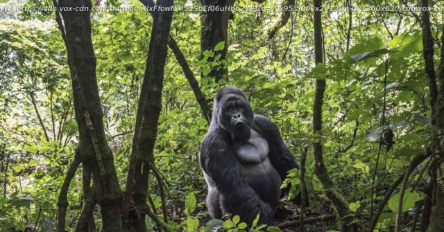
But let’s turn back to the headline figure from WWF’s report: 69 percent. That number suggests that if you average all the changes in wildlife populations, globally, since 1970 — a population of frogs is down, a community of gorillas is up, and so on — you’ll get a decrease of 69 percent.


