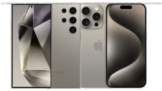
The Galaxy S24 Ultra looks a lot like the iPhone 15 Pro, and I don’t hate it. But it also looks like a Galaxy Note, and this gives me mixed feelings.
Samsung is pulling an Apple with the design of the new Galaxy S24 Ultra, and I don’t hate it
While it’s difficult to get excited for the design of the Galaxy S24 Ultra, which looks largely identical to that of the Galaxy S23 Ultra, which looks practically the same as the S22 Ultra, I must say that the subtle changes Samsung is going for seem very intentional, and (as I said in the intro) this makes me view them as a process of maturity…
It’s almost like Samsung has mastered Apple’s push-pull strategy of adding (obvious) upgrades one by one instead of going for a complete overhaul like the company used to do. So, it’s really no surprise that this creates a sense of satisfaction when you finally get JUST the design you’ve “always wanted” from day one.
Again, to draw a parallel to the iPhone, if you’ve ever held an iPhone 12 Pro, you’d know that holding the iPhone 15 Pro feels shockingly different (in a good way). Yet, that’s clearly a paradox, since the iPhone 15 Pro looks virtually the same as the iPhone 12 Pro. But that’s how Apple’s “refinement” strategy works.
It’s almost like seeing your kid grow – they learn how to use a spoon, then they learn how to tie their shoes, and then they learn to ignore you, because they are on their phone.
All Apple-style excuses aside, Samsung isn’t trying hard enough with the design of the Galaxy S24 Ultra
The Galaxy S24 series could’ve adopted the same button/side frame design as the cheaper Galaxy A55, which looks more modern now.
So, yes, the adoption of Apple’s “design refinement” strategy did teach Samsung (and Samsung fans) how to be patient when it comes to upgrades. But some people just… aren’t patient (you can find most of them on tech Twitter).
They want to see a new Galaxy/iPhone that makes them excited to buy and use it. You know – like the Galaxy S6 Edge and the iPhone X from a billion years ago.


