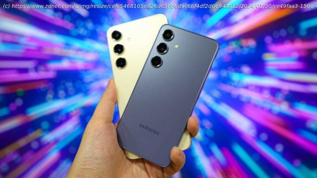
The latest Plus-sized Galaxy phone undercuts its Ultra sibling by $300 while getting feature upgrades in all the right places.
Samsung’s latest Galaxy S24 handsets, while released in January, are already in consideration for the best Android phones of 2024; that’s how well-rounded and future-proofed they are. But while I often reserve the « Best Overall » honor for the Ultra model, which fields all the latest and greatest features from the Galaxy maker, I need to think twice about it this year.
Samsung Galaxy S24
Samsung Galaxy S24 Plus
Display
6.2-inch Dynamic AMOLED 2x (1080 x 2340) with 2,600 nits of brightness
6.7-inch Dynamic AMOLED 2x (1440 x 3088) with 2,600 nits of brightness
Processor
Qualcomm Snapdragon 8 Gen 3
Qualcomm Snapdragon 8 Gen 3
RAM/Storage
8GB with 128GB, 256GB, or 512GB
12GB with 256GB or 512GB
Camera
50MP f/1.8 wide, 12MP ultrawide, 10MP telephoto (3x), and 12MP front
50MP f/1.8 wide, 12MP ultrawide, 10MP telephoto (3x), and 12MP front
Battery
4,000mAh with 25W wired/15W wireless charging
4,900mAh with 45W wired/15W wireless charging
Durability
IP68, Gorilla Glass Victus 2, aluminum frame
IP68, Gorilla Glass Victus 2, aluminum frame
Colors
Onyx Black, Marble Grey, Cobalt Violet, Amber Yellow
Onyx Black, Marble Grey, Cobalt Violet, Amber Yellow
I spent the past week solely using the Galaxy S24 models, with my personal T-Mobile SIM in the Plus and a Mint Mobile eSIM in the standard variant. From morning to night, I used the phones like how I normally would but with an emphasis on the new, most significant features. I also took more photos and videos than usual to see if there were any notable differences from last year’s S23 models, even though the camera specs are basically the same on paper.
Testing also involved the new Galaxy AI features, like running Live Translate and Text Call with friends and family who speak multiple languages (Chinese and Korean), redefining images with Generative Edit, and exploring the other practical ways that the new phones can improve our lives. For now, here’s what works and what doesn’t.
Flatter, more refined design: Both the standard and Plus Galaxy S24 phones this year look unapologetically similar to the iPhone 15, with flattened edges, symmetrical bezels, and a new OneUI lock screen/always-on dynamic that screams iOS 17. Even the antenna bands on the sides of the phones are nearly identical.
Here’s the thing: I really like the modern iPhone design, and Samsung’s approach takes things up a level. The bezels are thinner, the hole punch camera takes up less space, and the satin finish of the side railings makes the devices feel more premium than last year’s glossy material. I’ve been going around town caseless and both the Amber Yellow S24 Plus and Cobalt Violet S24 absolutely pop.
The Samsung Galaxy S24 Plus (left) on OneUI 6.1 and the iPhone 15 Plus (right) on iOS 17.3.
2,600 nits of brightness is mostly good: One of the more significant upgrades to the Galaxy S24 series is the 2,600-nit display, a feature that both casual and power users can benefit from. Whether I was navigating through the NYC streets or testing the phone cameras outdoors, never did I find myself squinting at the viewfinder or feeling like the adaptive brightness setting was turned off.
Home
United States
USA — software Samsung Galaxy S24 Plus review: A week later, I've forgotten about the...


