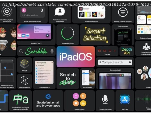
We’ve seen a quick glimpse at the new features coming to iPadOS 14, but it’s the lack of home screen improvements that leave us puzzled.
WWDC, Apple’s annual developer conference, kicked off Monday, with the headlining news that the company is moving away from Intel processors and will soon use its own Apple Silicon processors in the Mac line.
The Mac may have been the star of the show, but that doesn’t mean Apple didn’t pay attention to the rest of its product lineup. The iPhone is getting iOS 14, with new home screen features and improvements. The Apple Watch has a new sleep app, while TVOS is getting better HomeKit integration.
As for the iPad, well, it’s getting iPadOS 14. Right now, I think the update can best be described as a modest improvement.
Improvements include a new approach to the iPad’s interface within apps, Apple Pencil improvements, and an improved Search feature, but the lack of the same home screen improvements that the iPhone is getting is frustrating.
Below are the features that Apple highlighted in the keynote, and a temporary letter grade from me. As I learn more about iPadOS 14 and get to spend time actually using it, I’ll continue updating this report card.
There is a new Sidebar interface approach in iPadOS that, once apps update, will move category tabs from the bottom of the screen to the side of the display. For example, in the Music app, there used to be tabs along the bottom of the screen that you’d use to move between your library, new music, listening suggestions, and the like.
With iPadOS, however, all those tabs are now moved to the side, similar to how the Mail app displays all of your mailboxes.
This arrangement makes a lot more sense and should be easier to navigate, especially if you’re using a trackpad or mouse to get around the iPad’s interface. More apps will have to adopt the new design, but at first glance, it looks like this seemingly subtle change will do a lot to make the iPad’s interface look and function more like a normal computer. If nothing else, it will be familiar to users.
Another important change that’s bugged me for years is the fact that incoming calls take over the iPad’s entire screen, instead of showing up as a small alert, similar to new notifications.


