Mobvoi’s TicWatch Pro 3 is the first Wear OS smartwatch to use Qualcomm’s Snapdragon Wear 4100 processor, a big leap over the previous generation, but the watch also comes with its own perks.
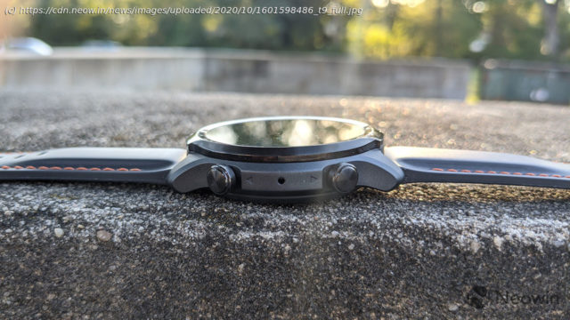
Last week, Mobvoi announced the TicWatch Pro 3, and probably the most significant improvement is the Snapdragon Wear 4100 chipset. In fact, it’s the first device to use the latest from Qualcomm, and it’s quite significant, as the Snapdragon Wear 4100 is the first major improvement to the chipset since Android Wear was introduced in 2014. But it also has some really cool features. There’s a dual-screen experience that switches between an analog face and a digital screen, saving battery life. It’s also thinner and lighter than its predecessor, and it’s more stylish. The TicWatch Pro 3 also comes with its own suite of fitness apps, such as TicExercise. For sleep tracking, it has TicSleep, making it one of the only Wear OS watches tracks sleep. It has TicHearing to tell you if it’s too loud where you are, and if that will affect your hearing. There’s all of that, and there’s more.577mAh Smart Mode: up to 72 hours Essential Mode: up to 45 days Input:5V1A(USB type A) Output:5V1A(pogo pin * 2) Provides Blood Oxygen Saturation Provides Stress Detection 24h Continuous Heart Rate Monitor Night Infrared Static Heart Rate Sensor with non-visable light Low Latency Off-Body Detection Sensvisible The thing about smartwatches is that they’re very personal. We’ll talk later about that aspect of the functionality, but of course, that applies to design too. As the saying goes, beauty is in the eye of the beholder; it’s completely subjective. I really think that for most people, priority number one in a smartwatch is that it will look good on them. But one thing that I’d say is pretty objective is that a device that’s thinner and lighter is more comfortable to wear on your wrist. The TicWatch Pro 3 is 12.2mm thick, so it’s not bulky at all, and it weighs in at just 43g, which is super light. With the silicone strap feeling soft to the touch, the whole package is definitely among the more comfortable smartwatches that I’ve worn, and I’ve worn a lot. I don’t just want to talk about the strap, even though I’m kind of in love with it and its orange stitching. Still though, you can swap it out for any regular old 22mm band, so if you want to change it up, you can do that. The rest of the watch, frankly, is just about what you’d expect. It’s black, made out of a combination of stainless steel and plastic. In fact, most of the chassis is plastic, although the top portion is the stainless steel part. It has a bit of a raised bezel there, and while I personally prefer a flat glass top, a raised stainless steel bezel has its advantages. For example, if you hit the watch against something, it’s less likely to impact the glass. It also has two buttons on the side. The top one acts as a home button, or it can take you to the app drawer from the home screen. As usual, the bottom button is customizable, and it defaults to the TicExercise app. Holding the top button launches Google Assistant, and holding the bottom button acts as a power button. The bottom is, of course, plastic. Naturally, you’ll find a heart rate sensor down there, and you’ll also find pins for charging. This is one area where I always criticize smartwatch vendors that don’t use wireless charging. If you use this device frequently, you’re going to sweat under it, those pins will get dirty, and charging it can become a pain point. Normally when I write a smartwatch review, I lump design and display into one category, since there usually isn’t much to talk about on such a small screen. In this case though, the screen is one of the things that makes the TicWatch Pro 3 unique. It uses dual-layered screen technology, and basically, that means that it has two screens.


