Google has released the first Android 12 developer preview. Join us as we go hands-on with this (very) early build of the OS.
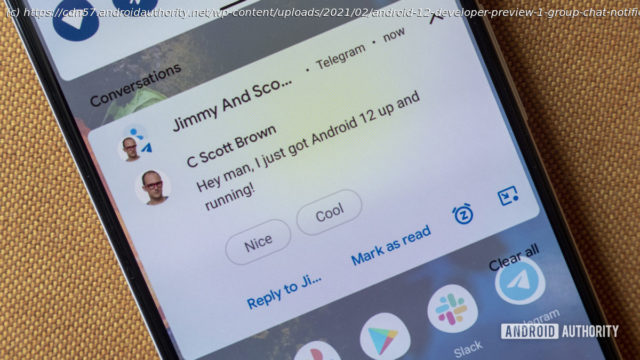
Today, we’ve had our first glimpse at the next major version of Google’s operating system, Android 12. The company has released an early developer preview, which is now available for download for various Pixel phones. According to Google, Android 12 is all about making the OS “more intuitive, better performing, and more secure.” Many of the changes you’ll find in this build are only for developers but will translate to meaningful experiences once the official, consumer-ready version of Android 12 is released later this year. For now, let’s dive into the very first Android 12 developer preview. Related: Android 12: Everything confirmed and rumored so far What’s new in Android 12? Credit: Jimmy Westenberg / Android Authority As is the case with many other early developer previews, we aren’t seeing too many visual changes to the operating system. At least, we’re not seeing the big UI overhaul that was rumored a few weeks ago. However, there are still plenty of little changes here and there. Android 12 notifications Google is yet again changing the look of the Android notification user interface. Notifications now have a more modern look. They take up about the same amount of space in the notification shade as before, but the layout and font size have changed. See the comparisons below for the difference as compared to Android 11. These are subtle changes, but ones you’ll no doubt notice if you’re used to the way Android currently handles notifications. Left: Android 12 developer preview 1, Right: Android 11 Credit: Jimmy Westenberg / Android Authority Google has added a handy little snooze icon on the bottom-right of each message notification. Tapping it allows you to quickly snooze the notification for one hour,15 minutes,30 minutes, or two hours. Furthermore, the background of notifications and quick settings has changed colors. Android 11 had pure white or pure black backgrounds for both notifications and quick settings. As one would expect, the background depends on your system theme. Android 12’s backgrounds have a bluish tint to them, even if you’ve chosen another color for your accents. We’re not entirely sure why this changed Perhaps it could be part of Google’s rumored theming overhaul for Android 12? We’ll need to keep an eye on this for future releases. Loading poll Google says it’ll be quicker to open apps from notifications in Android 12. Now, developers are encouraged to have notification taps trigger Activity starts directly instead of utilizing “trampolines” to start the Activity. These can cause significant delays, so Android 12 actually blocks notification trampolines. It does this by preventing them from launching target Activities. Google says the change will only apply to apps targeting Android 12. Credit: Jimmy Westenberg / Android Authority It’s important to keep in mind that this is a very early developer preview. Things will most definitely change in future releases. At least, I’m hoping Google changes the amount of dimming beneath the notification shade. Usually, pulling down the notification shade applies a dim underlay that lets you see your notifications more clearly. The dimming is nearly gone in Android 12, causing the monstrosity you see above when pulling down your notifications over the settings menu. Settings Certain parts of the settings menu are also getting a slight visual overhaul. The search bar on the top no longer stretches all the way to the right side of the screen. It’s a bit smaller now, while the profile icon on the right side has been enlarged. A new Safety & Emergency section can be found in the settings menu. This new section gives you quick access to emergency information (contact info, medical details, etc.). There’s also car crash detection, crisis alerts, wireless emergency alerts, and a new Emergency SOS feature. Emergency SOS allows you to trigger an emergency action by quickly pressing the power button five times or more. By default, the Emergency SOS feature is set to dial 911, but this number can be easily changed. However, if you enter a non-emergency number, your phone must be unlocked to use it. The settings menu will likely get even more of a revamp in future releases. XDA’s Mishaal Rahman found a one-handed mode that can be enabled via a feature flag on some Pixel devices. This essentially applies a Samsung One UI-like layout to the settings menu, complete with large text headers and a layout that should be much easier to reach on big-screened devices.
Start
United States
USA — IT Android 12 developer preview hands-on: Lots of little changes Android 12 developer...


