Array
Five months ago, I went from being a die-hard Samsung Galaxy fan to a sellout iPhone owner. Since then, I’ve fully adapted to the world of Apple and have been basking in the perks of features like AirDrop and iMessage (mostly to the delight of my friends, who were sick of my green texts).
But I still have a soft spot for Galaxy phones, and when Samsung unveiled the S23 lineup in February, I was eager to see how the top-of-the-line S23 Ultra would compare to my iPhone 14 Pro. So I got my hands on one and began using the phones side by side to compare everything from the cameras to battery life to overall design — and to see whether I’d have any regrets about switching to the „dark side.“ Here’s what I found.The Galaxy S23 Ultra’s display vs. Apple’s Super Retina screen
First things first: I have an iPhone 14 Pro, and not a Pro Max, so the Ultra’s massive screen definitely stands out in comparison. I never feel like I need a bigger screen than what I get on my 14 Pro, but it definitely doesn’t hurt to have that larger display when I’m watching a YouTube video or streaming a show — or spending too much time on TikTok.
The trade-off to having that larger screen is trying to fit it in my pocket and having to carry something a bit bulkier. Still, it’s a pretty sleek phone for all that real estate.
The display quality on both phones is stellar, and I don’t see much of a quality difference between the two. Right out of the box, the S23 Ultra has a nice bright display, which you can achieve on the iPhone by turning off True Tone (a feature that adjusts the color and intensity of your display depending on your environment). If the brightness on the Ultra is too much, you can inversely mimic the effects of True Tone by going into Display settings and either toggling on Eye comfort shield or going to Screen mode and selecting Natural. You can also play with the White balance scale. Images on the iPhone look slightly sharper, but colors pop a bit more on the S23 Ultra. Overall, though, there’s really not much of a difference between the phones.
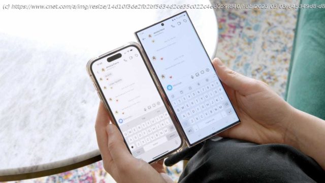
There’s one aspect to having an iPhone that I haven’t quite made peace with yet, and it’s the keyboard. I’m glad Apple added Slide to Type with iOS 13 a few years ago, followed by haptic feedback on the keyboard with iOS 16 (finally), because those are features I loved on Android. But I still get frustrated that I have to switch between numbers and letters when I’m typing on the iPhone. Meanwhile, on the Galaxy, the numbers sit just above the letters, so you can select them more quickly, the way you would on a laptop keyboard. You can download different keyboards on the iPhone like Gboard, but it’s not the same. I’ll admit that’s a minor complaint, but I do think the user experience would benefit from Apple taking a page from Android’s book — you know, like they’ve done many times before. Moving on….The Galaxy S23 Ultra’s battery life is next level
I’ve had my iPhone for a few months now and thankfully haven’t seen any noticeable drops in battery life yet. My phone still lasts a full day of heavy use, but I always need to charge at the end of the day.


