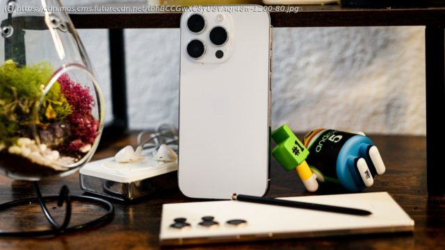
Even though the Galaxy S23 is feature-packed, there are some features the iPhone 14 family has that Samsung can’t match.
Comparing the best phones you can buy, recurring themes emerge. The iPhone is refined and elegant, with a simplified interface. The Galaxy is robust and powerful, packed to the gills with features and tweaks. That doesn’t mean the Galaxy isn’t an elegant device, and it certainly doesn’t mean the iPhone isn’t capable. In fact, there are many things the iPhone 14 can do that even the best Samsung phone cannot.
The Galaxy S23 Ultra is loaded with so many features, it used to be two different phones. Samsung’s Galaxy S family ate the Galaxy Note family, including the hidden stylus and all of the advanced cameras. Today’s Ultra can do so much, maybe too much, but even though iPhone fans love the simplicity of Apple’s device, there are still plenty of features that give the iPhone bragging rights.
Among these may be the Apple A16 Bionic processor, but those benefits won’t be as clear to most users. The best iPhone benchmarks better than any Android phone, even Samsung’s best, but Apple’s iOS is less ambitious. You won’t find the iPhone putting that power to use running multiple apps in side-by-side windows, or driving a monitor and keyboard in a desktop environment.
Here are the real benefits you’ll enjoy if you go for an iPhone 14 over a Galaxy S23. The button the iPhone 14 has and the button it doesn’t
The iPhone 14 has a mute switch, long a staple of the iPhone family. Apple loves minimalist design, but there are still four buttons on the iPhone, including the switch. Other phone makers dropped the mute switch, but Apple has kept it, giving iPhone owners a quick way to silence the phone in a hurry.
It speaks to Apple priorities, especially as the first mainstream smartphone. If the smartphone is going to intrude on our daily lives and relationships, it’s nice that Apple gives us a quick way to shut it up. It’s important to Apple that the phone doesn’t become an intrusion.
Unlike Android phones, the iPhone has never had a back button. Modern Android doesn’t use navigation buttons, but you can still swipe to go back. Apple has never offered a back button. You can swipe up and quit to the home screen, that’s it.
Why is this a good thing? Because it forces app designers to think in paths that are more friendly to the user. If there is always a back button, always a way to fix a wrong choice, then designers can be more careless with interface designs. Apps can allow users to make a mistake if there’s a back button to find the right choice instead.


