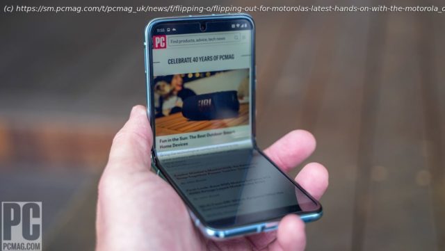
Motorola bets on style and a huge external screen to turn Galaxy Z Flip fans‘ heads.
Motorola today introduced new versions of its iconic folding Razr phone. This time around, there are two models. There’s the simpler and more affordable Razr, which will be out later in the year, as well as the premium Razr+, which features a spacious 3.6-inch external display and near-flagship specs. Motorola is betting on the big outer screen and fashion-focused details to capture the eye of the style-conscious buyer. The Razr+ is very much a Galaxy Z Flip 4 competitor, which Samsung is poised to update later this year. Will Motorola’s fresh design appeal to folding phone enthusiasts? Here is our first look.
There’s a brand-new design for both models of the Razr. The retro chin of the older model is now gone. Instead, the Razrs take on a modern look that strongly resembles the Galaxy Z Flip 4, Oppo Find N2 Flip, and others.
The two Razr models share a lot of the same features. You’ll get a large 6.9-inch screen on the inside, an aluminum frame, Gorilla Glass Victus on the external screen, an IP52 rating for dust and water protection, as well as a new hinge that will support mid-way angles with a range of 40 to 130 degrees. The previous Razr either was open or closed, so this new range of angles is quite a welcome change.
Both phones also have stereo speakers with Dolby Atmos and Spatial Sound. One speaker is downward-firing, while the other can be found at the earpiece speaker on the top of the opened device in a small slit. The Razr and Razr+ can handle tap-to-pay thanks to NFC and the duo includes physical SIM slots as well as support for eSIM.
Both phones will ship with Android 13 and see three OS upgrades and four years of security updates.
Let’s talk about the elephant in the room, which is the biggest difference between the two phones. The external pOLED screen on the Razr+ measures 3.6 inches in a 1:1 aspect ratio with a resolution of 1,066 by 1,056 pixels, a pixel density of 413ppi, and a refresh rate of 144Hz. Motorola is touting this as the largest external display on a flip phone. For comparison, the Razr has a 1.5-inch pOLED with 192 by 368 pixels, and the 2020 Razr had a 2.7-inch external display with 800 by 600 pixels.
The external screen was plenty bright under direct sunlight during the time we spent with the phone. There are two cameras embedded within the external screen, which could be an issue for those trying to type on the full-sized keyboard that can appear there. However, the camera placement did not cause any issues for me as my thumbs naturally hovered over the lenses to type.
Motorola created specialized mini-apps it calls Panels that are designed to fit the outer screen. They resemble the widgets you’ve probably seen on your Android phone. You are not stuck with just the Panels, however; you can use almost any app on the outer screen if you give the app permission to be there. This is done on an app-by-app basis. Motorola also allows you to bring apps from the inner screen to the outer screen in the settings, a feature called Continuity. For example, you could be working on a Google Doc on the inner screen, close the phone, and then you’ll have the option to continue on the front screen depending on your settings. This Continuity feature worked seamlessly while testing it out.
If you choose to type on the front screen, a spacious keyboard shows up while the text input area is limited to a single line above the keyboard. The rounded corners felt comfortable in the hand and your index fingers will rest nicely on the flat hinge area.
Start
United States
USA — IT Flipping Out for Motorola's Latest: Hands-On With the Motorola Razr+ and Razr


