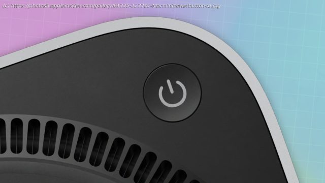
Apple’s decision to place the power button of the M4 Mac mini underneath has been questioned by users. In some cases, they’ve come up with their own „solutions“ to the problem.
Apple’s decision to place the power button of the M4 Mac mini underneath has been questioned by users. In some cases, they’ve come up with their own „solutions“ to the problem.
The introduction of the M4 Mac mini was welcomed by critics, with the already small Mac made to be even smaller. Getting to that size meant there had to be a compromise, and that took the form of an awkward power button placement.
Rather than at the rear, the button is instead underneath the corner of the Mac mini’s enclosure. It’s in a position that you have to lift or tilt the Mac mini to access it, which can be awkward for people with larger digits.
This isn’t seen as a problem to Apple. In one interview, SVP of Worldwide Marketing Greg Joswiak and SVP of Hardware Engineering John Ternus believed that access was still easy.
Even so, it’s still a non-problem to them. „Honestly, most people almost never use the power button on a Mac“, they commented.
While true, with most users habitually putting the Mac mini to sleep rather than shutting it off, there are still times that the button must be pressed.
Homebrew fixes
The issue of a badly placed button has led to ingenious Mac users to come up with alternative ways to press the pushable control.


