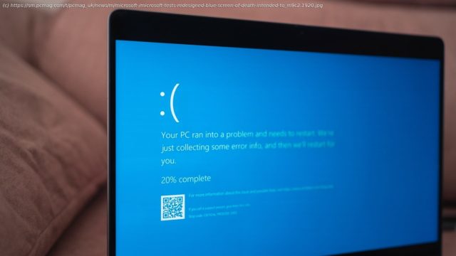
No more frowny face? The BSOD in the latest Windows 11 preview build goes for a more minimalistic look. It’s also green, but that should change in the final version.
Microsoft’s infamous Blue Screen of Death (BSOD) has long symbolized frustration, panic, and lost work. But the company is now considering a redesign for the dreaded crash alert.
Microsoft is testing the revamped BSOD in a new Windows 11 preview release that began rolling out last week. It’s intended to simplify the alert with more blank space and a smaller font.
“We’re previewing a new, more streamlined UI for unexpected restarts which better aligns with Windows 11 design principles and supports our goal of getting users back into productivity as fast as possible,” the company says.
Start
United States
USA — IT Microsoft Tests Redesigned 'Blue Screen of Death' Intended to Be Less Ominous


