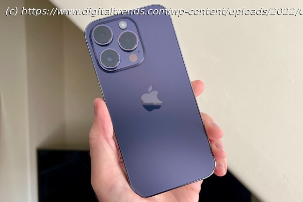
The iPhone 14 Pro may not look new, but it has all-new technology and software inside. We’ve used it for a while, and think you’re going to love it.
Everything about the iPhone 14 Pro feels entirely effortless. The design is expertly judged and modern, the software is incredibly simple to use, and the camera takes even better photographs than its predecessor. But effortless can be taken another way, too, in that it’s not exactly the most daring update over its predecessor.
Let’s talk in detail about whether the iPhone 14 Pro is worth the effort on your part to either take the plunge into Apple ownership or upgrade from an existing iPhone. If you’re looking for a less expensive option, check out our iPhone 14 review. And if you prefer your iPhone to be bigger and more expensive, see our iPhone 14 Pro Max review.
If you’ve seen an iPhone 12 Pro or iPhone 13 Pro, the iPhone 14 Pro will be very familiar. It has the same flat, squared-off chassis that still feels slightly too sharp in your hand, but is beautifully made from stainless steel. Apple’s Ceramic Shield is over the screen and there’s toughened glass on the back. An IP68 water-resistance rating adds confidence, as the phone will avoid damage from accidental water spills. The volume controls and power button are still in place on the side, and if you buy an iPhone 14 in the U.S. you won’t find a SIM tray, as this is the first iPhone to only accept an eSIM.
The 6.1-inch Pro is beautifully balanced in your hand, and it is usable with one hand too. It’s no featherweight at 206 grams, but it never feels ungainly at 71mm wide and 7.8mm thick, plus I have not had any fatigue from holding it for long periods of time. It can be a slippery thing, though, and protecting it with a case will help keep it from making an unwanted break for freedom. There are several ordinary colors (black, silver, or gold), but go for the lovely new Deep Purple and choose a transparent case. It looks almost black in some situations, but get it in the right light and the purple absolutely pops. Even the chassis has a purple hue. I think it looks excellent.
On the back, the camera module is large and makes a bold statement when the iPhone 14 Pro isn’t in a case, but because the three cameras protrude considerably, the phone never lays flat on any surface. It all adds up to a smartphone that’s unmistakably an iPhone. This isn’t a groundbreaking design, there’s nothing especially flashy about it, yet it manages to be classy and cool, fitting in with every situation. It doesn’t demand attention, but it will still get admiring glances, particularly if you choose the purple one.
Would I have liked to see a design that wasn’t almost exactly the same as the last two models? Yes, that would have been good. Does it strictly need to look any different? No, not at all. Apple has got the Pro formula right — classy looks, just the right size and weight, high-quality materials, and stellar build quality — so it can’t be blamed for not making dramatic changes with the iPhone 14 Pro. The one thing I’d have liked to see is more color options, but I expect those will come later to keep the range fresh.
The new 6.1-inch Super Retina XDR screen, with its 2556 x 1179 resolution and 460ppi pixel density, has some tricks up its sleeve. Before we get into the big changes, it’s worth mentioning the brightness. It reaches 1600 nits normally, but can boost to 2,000 outdoors in sunlight, and the difference is noticeable. There’s a “bump” when the extra kicks in, and the screen really does become brighter and easier to read when the sun is beating down.
However, it’s the always-on display that’s the largest, most obvious new screen feature. Android phones have had always-on screens for years, showing the time, battery, and notification icons against a black screen. Apple’s always-on screen is essentially just a dimmed version of the lock screen, in full color, and with dynamic widgets and notification alerts. It’s the Apple Watch’s always-on screen, just on your phone. It’s also so much more than we’ve seen on any other phone, with the time and date highlighted in a bright white font over your choice of wallpaper, and notifications clearly showing the icon and basic details about each one.
Controls for music and audio apps also stay on-screen and a quick tap wakes them up, ready to pause or change tracks. I’ve found the whole lock screen experience to be sharper and faster to react than before. I use the phone in my car for music, and where before it took multiple taps to make anything work, it’s a single tap and an instant reaction on the iPhone 14 Pro. The always-on screen is beautiful, useful, and a step above implementations we’ve seen elsewhere in terms of design. But it may not be helping battery life, which we’ll come back to later.
Apple’s 120Hz ProMotion feature makes a return and should be considered a strong reason to choose the Pro model over the standard iPhone 14. The higher refresh rate provides smoother scrolling and less-jarring animations, and doesn’t cause as much eye-strain. It quickly becomes “invisible,” but you will absolutely notice its absence. Watching video on the iPhone 14 Pro, the screen comes alive with stunning colors, deep blacks, and pitch-perfect contrast. Even the stereo speakers are some of the best in the business. There’s clarity, power, and actual presence to the sound, and I can happily watch videos and listen to streaming music through them for long periods of time.
The iPhone 14 Pro has a fabulous screen, and it’s sure to be even more immersive and pleasurable to view on the bigger 6.7-inch iPhone 14 Pro Max … if you can bare the extra weight and price of the device.
Dynamic Island, Apple’s cringey name for the expanded pill-shaped notch replacement at the top of the screen, is most definitely a work in progress. At the moment, it’s relatively simple, showing information about Bluetooth connections, screen and voice recordings, face unlock alerts, and timers. Apple’s Live Activities feature isn’t ready yet, and developers haven’t been given access either. When these things happen in the near future, Dynamic Island’s usefulness will skyrocket.
For now, what you see is potential. The Dynamic Island never feels intrusive, and the functionality it does provide is helpful. Music controls are the best example, as a short tap takes you directly to the app that’s playing, and a longer press reveals a set of quick controls. Although these features can be found elsewhere in iOS, it’s undeniably fast and intuitive to use the Dynamic Island, and it bodes well for the future when more apps make use of it. It’s also a seamless thing of beauty, as the software morphs and shifts around the hardware component so slickly that you really can’t tell where one begins and the other ends.
The iPhone 14 Pro comes with iOS 16 installed. In addition to the new battery percentage display and the excellent haptics, much has been made about customizing iOS 16’s lock screen, and I remain unconvinced it’s necessary or beneficial. Even the new Settings page to change the wallpaper and add widgets is needlessly complicated and rather confusing.
Home
United States
USA — software Apple iPhone 14 Pro review: effortlessly and unquestionably superb


