The Nothing Phone (2a) might be the most complete package in the sub Rs 25,000 segment. Is it worth a buy? Shubham Raheja reviews.
At MySmartPrice, I’m the resident Nothing specialist. After all, I have reviewed both phones made by Carl Pei’s new venture over the last two years. So, when I heard the Nothing Phone (2a) was in the pipeline, I couldn’t help but raise an eyebrow. That’s because even till the start of this year, I was positive that the Phone (1) and (2) were enough to keep the brand’s smartphone division afloat till the Phone (3) arrived.
But having used the new Phone (2a) for the last two weeks, I’m truly surprised how far Nothing has come along. The Phone 2(a) has a polarising design, sure, but it’s memorable. It’s the first MediaTek-powered Nothing device; it’s stable, thermally and otherwise. So, it feels far more polished than the Nothing Phone (1) but isn’t a large compromise on the Phone (2).
Oh, and so far, I have received about four updates – the latest one this morning, on the day of its launch! And every update introduces major improvements, whether in performance, camera or user experience. That’s why I wish to revisit this phone in the coming weeks.
Alright, enough preamble! Let’s jump into my initial review.Nothing Phone (2a) Review: Design
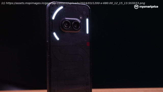
Before you form any preconceptions about the (2a), let me begin by saying the dual cameras on the rear panel are intentionally kept that way. Yes, you may think the phone’s squinting at you, but that’s part of the phone’s ‘anthropomorphic’ design philosophy.
It means the Phone (2a) wants to look part-machine-part-human. It’s a thought-provoking design, meant to challenge the conventional ‘feathery’ or ‘glowing’ rear designs. This is surrounded by a large circular NFC strip, making it look even more like a face.
The total area of glyph lights has been reduced, and the layout is now solely on the top half of the phone, around the camera. It still looks cool, though.
Remember the pillowed rear glass of the Phone (2)? That sort of makes a comeback here. While the Phone (2a) is as flat as the Phone (1), it utilises that curved glass design around the camera bulge. Nothing claims this improves drop resistance and makes for a nice in-hand feel – I can definitely vouch for the latter.
Nothing went wild with the squiggly strip on the rear panel’s bottom half this time.


