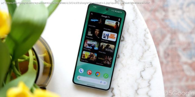
Google TV is redesigning the top portion of its mobile Android app to allow for a more immersive, search field-less UI.
Google TV is redesigning the top portion of its mobile Android app to allow for a more immersive, search field-less UI.
The app has long featured a full-width search bar with “Google TV” branding in the middle. It’s joined by a voice input shortcut and account switcher/menu. In the “For you” tab, artwork is rounded at the top corners.
Current
One of the devices we’re seeing it on is a Pixel Fold. The large screen UI is unchanged at the moment.


