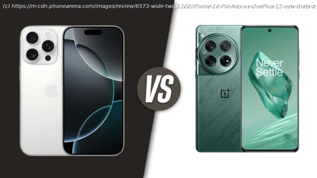
The iPhone 16 Pro Max has settled a bit — can the OnePlus 12 gain up on it?
Intro
The iPhone 16 Pro Max has just been announced — Apple’s next big bad smartphone that, like it or not, will become the industry standard that other flagships measure up to. Whether it be other expensive premium phones — like the Galaxy S24 Ultra — or handsets that are priced more aggressively, but cut down on some extras. like the OnePlus 12!
Now, don’t take us the wrong way — we think the OnePlus 12 is an excellent phone with a lovely design, very snappy performance, and decent camera. In fact, let’s compare how Apple’s new heavy-hitter stands up to the OnePlus 12.
iPhone 16 Pro Max vs OnePlus 12:
iPhone 16 Pro MaxOnePlus 12
Titanium frame, beveled but otherwise flat sides Slightly curved display and back panel edges
6.9-inch OLED display, 120 Hz, 2,000-nit peak 6.8-inch OLED display, 120 Hz, 4,500-nit peak
Apple A18 Pro, 8 GB RAM Snapdragon 8 Gen 3, 12 GB, 16 GB RAM versions
Apple Intelligence, full AI suite coming with iOS 18 Clean Android with the Google Assistant / eventually Gemini
20 W wired charging Superfast 80 W wired charging
25 W MagSafe chardging Very fast 50 W wireless charging
Triple camera, with a 5x telephoto Triple camera, with a 3x telephoto
Action Button, Camera Control Hardware mute switch on side
Table of Contents:
Design and Display
Performance
Camera
Audio Quality
Battery and Charging
Specs
Summary
Read more:
OnePlus 12 review
iPhone 16 Pro Max review
Design and Display QualityApple doubles down on titanium
The new iPhone 16 Pro Max looks a lot like the iPhone 15 Pro Max, but does add more. stuff to the existing formula. Most obviously — a new Camera Control Button, which we will get into later. That’s another addition to last year’s Action Button, which can be programmed to do various different things. Then, the screen is slightly bigger than before — now at 6.9″, thanks to slimmer bezels. And the titanium finish comes in a new color, called Desert Titanium — kind of brown.
The OnePlus 12 also looks very similar to its own predecessor — it’s a softer shape with rounded corners, with a curved display edges, and a curved back panel. With that much tapering, the OnePlus 12 feels incredibly thin, and it’s also on the lighter side. Though, its metal frame ends up being quite thin — those that are looking for a nice flat edge to grip on to will immediately prefer the iPhone here.
The OnePlus continues to be the only Android flagship to have a hardware mute switch, which is wild — that’s such a convenient little controller to have!
iPhones have had those for ages, though the classic mute switch is now a new Action Button, which can be programed to do more than just mute the phone. But not more than one thing at a time — you assign it an action and that’s it. Kind of a letdown, yes.
For biometric locking, we have Face ID on the iPhone 16 Pro Max — obviously. It’s quick, intitive, and secure. On the OnePlus 12, we have an optical under-screen fingerprint scanner, which is also very good. It’s quick to read and unlock the phone and mostly accurate.
The OnePlus 12 is up in two color options — the flagship finish you will be seeing in all promo materials is the new Flowy Green, which looks almost like a liquid frozen in time. Then, there’s the Silky Black, with the back glass having a disctinct grippy texture applied to it. The iPhone 16 Pro Max colors are Black, White, Natural, and Desert Titanium, with the latter dominating the marketing materials and seeming to be the audience fave as well.
On the bottom, we get USB C ports — now standardized across the industry. And both support USB 3 transfer speeds, welcome to 2024!
As for what’s in the box — OnePlus uses special SuperVOOC chargers to get its incredibly fast charging speeds. So, it includes the 80 W wallplug in the box, making sure you can enjoy the optimal charging! The iPhone.


