The new Mac mini will launch in stores and begin arriving to customers this Friday. Ahead of time, the first reviews of Apple’s latest redesigned.
The new Mac mini will launch in stores and begin arriving to customers this Friday. Ahead of time, the first reviews of Apple’s latest redesigned computer have been shared by select media outlets and YouTube channels.
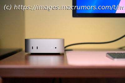
Every time I glance over at the new Mac Mini on my desk, it feels like the Mini’s ideal form. The redesigned enclosure makes the most of Apple Silicon’s small footprint, and with Apple’s M4 chip and an ample selection of ports, the 2024 Mini should remain a zippy, reliable computer for years to come. It’s never been more mighty.
The M4 Pro version of the new Mac mini also supports Thunderbolt 5 connectivity, with a total of three type-C ports on the rear. WIRED’s Brenda Stoylar on the new design and ports:
A lot of people compared the Mac Mini’s new look to an Apple TV box, but I think it looks more like a mini Mac Studio—especially with the new port arrangement. Apple finally added ports to the front (a gripe I had with the M2-powered version), which means I can spend less time annoyingly reaching over to the back to plug a cable in.
The M4 model comes with two USB-C ports that support USB 3.0 and a 3.5-mm headphone jack. The other side has three Thunderbolt 4 ports (the M4 Pro variant has three Thunderbolt 5 USB-C ports for the first time ever) along with an HDMI, an Ethernet connection, and a power port. It marks an official end to the USB-A port on a Mac Mini.
Reviewers also commented on the location of the power button, which is now placed on the bottom of the device rather than the rear. Stoylar added:
Ports on the front are great. Moving the power button to the bottom? Not so much. It used to be on the back, but this new implementation isn’t intuitive. I have to pick the device up and press the button to power on my desktop. It’s just weird. You’ll probably leave this thing on all the time but, like the USB-C port on the underside of the Magic Mouse, it’s just an awkward design choice.
The Verge’s Chris Welch on the new Mac mini’s relocated power button:
.Apple made the curious decision to move it to the bottom of the machine near the rear left corner.


