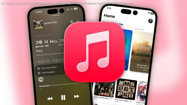
Apple Music in iOS 26 added AutoMix. auto-translation of lyrics, and more. Here’s how the updates compare against what’s in iOS 18.
Apple Music in iOS 26 added AutoMix. auto-translation of lyrics, and more. Here’s how the updates compare against what’s in iOS 18.
The Apple Music app often receives new features as part of the iOS update treadmill. For iOS 26, that chiefly involves changes to the listening experience.
However, there are still other smaller changes that appear within the music streaming app.
This is what you can expect in the transition from Apple Music in iOS 18 to the upcoming iOS 26.
Music iOS 26 vs iOS 18 – General appearance
Opening the Music app, you’re presented with the Home page as usual, complete with a selection of top picks, recently played music, and your profile pic in the top right corner.
While the content of Home is also identical between versions, the way the icons at the bottom are presented has changed considerably. In iOS 18, it was a frosted glass bar covering the entire base section, with a bubble above displaying the current track and basic media controls.
Under iOS 26 and the Liquid Glass initiative, the frosted glass bar has been dialed down to be more transparent, and the icons are all encased in a new glass blob UI. Home, New, Radio, and Library all appear in one long blob, with the Search icon in its own.
The currently-played song is in a third long blob, though slightly thinner than before and displaying more details too.
This is more than just a visual aesthetic change, as there’s also movement. Scroll through the page, and the Home-Library icon blob will shrink down to a single-icon circle, while the now-playing blob will truncate a bit and slide into the gap.
What once took two lines now takes up half the space, which is extremely handy as it maximizes the view of the page by minimizing distractions. If you need to go to a different section, tapping that shrunken Home blob will shift the blobs back and make everything accessible again.
Tapping your profile picture in the top brings up your account, including options to redeem gift card codes, add funds to the Apple Account, manage your subscription and family settings, and other elements.
The elements in this section haven’t changed at all between the versions, except for the roundness of white sections that each selectable item is encased within and the size of the toggles.
Music iOS 26 vs iOS 18 – Library and pinning
At first glance, the Library section hasn’t really changed that much either. Everything’s using a little more whitespace and is a bit more rounded to match up with the Liquid Glass ethos, as you would expect.
However, the top of the page in iOS 26 has a big hint that there are changes, if not immediately apparent. « Pin Your Go-To Music », the app declares, which refers to an option where you can select a song or album to be pinned to the top of the Library, above even the list of sections.


