The latest update to Apple’s website adds a dedicated « Store » tab to the top of the page. The title of the page is « Store », with a description on the first page
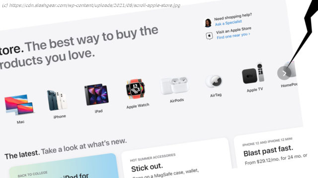
The latest update to Apple’s website adds a dedicated “Store” tab to the top of the page. The title of the page is “Store”, with a description on the first page: “Store. The best way to buy the products you love.” Apple is identifying their store in the same way they identify Apple Watch as “Watch” – they making it clear that the user is already in the Apple universe, so there’s little need to further differentiate this “Store” from any other. The design of the Store page in the Apple website is clearly aimed at mobile users. The design relies on side-scroll menu action – most naturally navigated with a touchscreen interface. Without a touchscreen, users must hover over the rightmost part of any horizontal collection of elements to see a > (right arrow) to scroll. The top row of products does not match what’s offered at the top level of the Apple website. We still start with Mac on the left – that’s still the product that makes the most sense to appear at the start of the list. It’s likely this has a bit to do with precedent, a bit to do with the name “Mac” starting with a capital letter, and a bit to do with the fact that the Mac is generally the most expensive product in the store. Next we have iPhone, then iPad. This is the reverse order of the same products at the head of the website. Again, this likely has to do with the chosen imagery and the pattern of products that appears on the first screen with this listing on a mobile device.


