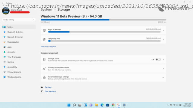
News, Reviews & Betas which includes large community peer support Storage settings has received some notable improvements in Windows 11 with some UI changes. There is also a new dedicated page for disks and volumes, as well as tighter integration with OneDrive.
It’s been a few weeks since Windows 11 started rolling out generally ( check out our review here), but since it’s being distributed in a staggered manner, not everyone has it yet, even if they’re on a supported machine. Although there are ways to skip the queue and trigger the update immediately, it’s perhaps advisable to know what you’re getting into before you decide to make the jump to Microsoft’s latest OS. This is exactly why we have been discussing Windows 11’s features in more detail in our ongoing Closer Look series. So far, we have taken a look at Search, Widgets, the Start menu, Snap Layouts and Snap Groups, the Taskbar, quick settings and notifications, Virtual Desktops, power and battery settings, default apps configurations, File Explorer, context menus, Teams integration, the updated Clock app in Windows 11, the Microsoft Store, the Snipping Tool, the Paint app refresh, the lock screen, the revamped Photos app, and the voice typing experience. Today, we’ll be discussing storage settings in Windows 11. For the purpose of this hands-on, we’ll be taking a look at the generally available Windows 11 build versus a publicly available and up-to-date Windows 10 (version 21H1 build 19043.1288). Although we usually follow a format in our Closer Look articles where we first discuss the Windows 10 offerings before comparing it to Windows 11, we’ll be deviating a bit from that this time because, frankly, it’s not worth it considering there are smaller enhancements here and there rather than a full revamp. When you launch storage settings in Windows 11, you’ll notice that the landing page has been redesigned. Now, you get the most essential information – which is your drive’s storage space on the top -, while other information is nested at the bottom. For some reason, Windows 10 showed Storage Sense at top, which is fortunately not the case here. Below the drive’s storage, you’ll get some more granular categories such as Apps & features and Temporary files, but if you want to see more categories, you’ll be directed to a dedicated page rather than a list being populated on the same page like Windows 10.


