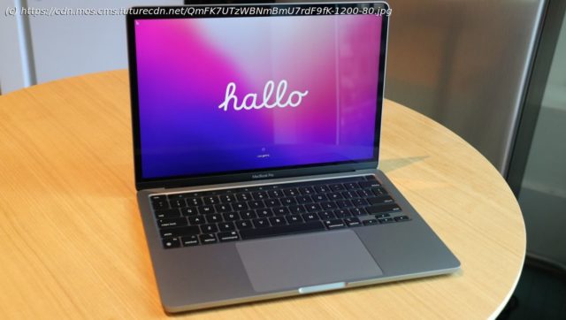
Hands-on with Apple MacBook Pro 13 M2 and the still-great Touch Bar.
Apple’s new MacBook Pro 13-inch is, obviously, a great showcase for the newest member of the Apple Silicon team: the M2 chip. But it’s also a reminder that we cannot have our Apple-cake and eat it, too. As Apple ushers in its remarkably powerful and power-efficient M2, it’s also preparing the smart and useful (and unfairly maligned (opens in new tab)) Touch Bar. I know, it’s confusing. Apple took its newest silicon and stuffed it inside an aging design featuring its one-and-only Mac touch screen. But everything about the laptop, which we explore in our full MacBook Pro 13-in. (2022) review, screams “This is the end.” And it is, at least for the Touch Bar. To understand what a big deal the Touch Bar was when it debuted six years ago, you have to go back to Apple co-founder and former CEO, the late Steve Jobs. Back in 2010, and not long after Apple unveiled the first iPad, Jobs dismissed the idea of a touch-screen laptop (opens in new tab):
“We’ve done tons of user testing on this, and it turns out it doesn’t work. Touch surfaces don’t want to be vertical. It gives great demo but after a short period of time, you start to fatigue and after an extended period of time, your arm wants to fall off. it doesn’t work, it’s ergonomically terrible. Touch surfaces want to be horizontal, hence pads,” said Jobs. Granted, it was a spurious argument. Within a few years, we’d see Magic Keyboards that would float iPad Pros in a more or less vertical plane above full-sized keyboards. On the surface of things, the M2 MacBook Pro 13-inch seems like an excellent Apple laptop for your friendly neighborhood creator. In my benchmark tests, the M2 handily beat its M1 predecessor (and an 11th Generation Intel Core i7). Its graphics numbers are stunning, thanks to the default 10-core GPU. The $1,299 starting price gets you 8GB of unified memory, and a 256GB SSD.


