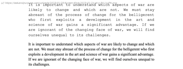
To build a more lethal force, the Marine Corps should follow the State Department’s example and adopt a font for the 21st century.
Over two years into the implementation of Force Design 2030, the Marine Corps is in the midst of “transform[ing] our traditional models for organizing, training, and equipping the force to meet new desired ends, and do[ing] so in full partnership with the Navy.” It is well established that “[o]ur ability to innovate is a hallmark of the Corps,” but it is also accepted that “[d]eep institutional change is inevitable when confronting modernization on this scale, and that type of change is hard.” Through significant efforts, the Marine Corps has implemented a seismic change in shaping our force to increase its lethality, mobility, and resiliency.
While Marine Corps Commandant Gen. David H. Berger has set the priorities of what needs modernizing, it is also incumbent on the rest of us to see if there are better ways of doing business that fall within the innovative intent of Force Design 2030. One such change to consider is the font we use for our correspondence.
Although small in comparison to what Force Design 2030 proposes, there are better options that could improve the readability, efficiency, and persuasiveness of our documents which would ultimately make us a better force. And while this may sound like a mundane and minor concern, rest assured, it is anything but. Consider this month’s revelation that the U.S. State Department is shifting from Times New Roman to Calibri, a change undertaken in the name of accessibility that launched a flurry of responses from observers within and outside the department. Regardless if one agrees with the State Department’s ultimate choice, the change itself proves our point: font choice matters.
So where does the Marine Corps stand on this issue? According to the Department of the Navy Correspondence Manual, we are currently instructed that “Times New Roman 12-point is the preferred font style and size for official correspondence, but Courier New may be used for informal correspondence.” But within the Marine Corps, there is an astounding refusal to abandon Courier New for something better. Talk to almost any staff officer, and they are still working almost exclusively with Courier New for executive summaries, routing sheets, and possibly still with official correspondence despite this font being expressly limited to less formal matters. One likely reason is that old templates die hard; formatting with a new font, as we all know, is a nightmare, especially when a command has an established preference.
Ultimately, as recognized in Force Design 2030, there remains “a certain ruthlessness to abandon familiar ideas, capabilities, and platforms which no longer provide a relative advantage,” explaining the likely reluctance to cut ties with Courier New. But familiarity aside, we have to recognize that Courier New provides no advantage, and there are vastly superior options. Words matter; font does too.
In 1955, International Business Machines Corporation (IBM) commissioned Howard “Bud” Kettler to create a new typeface for its typewriters called Courier (Courier New is the identical font on computers). Originally bearing the name “Messenger,” Kettler finally settled on “Courier,” because “a letter can be just an ordinary messenger, or it can be the courier, which radiates dignity, prestige, and stability.” Like many of the emerging social conveniences of the 1950s and 1960s, Kettler’s new typeface represented the cutting edge of American innovation and design. Especially when, as Slate put it, “[c]ompared to previous typewriter fonts, Courier looked streamlined, rational, efficient, a move away from the ‘Antique’ past — the perfect face for IBM.”
Courier New once represented the cutting edge of typography, but time has rendered it a relic of a bygone era. What used to be at the forefront of artistic endeavor and scientific discovery is now quaint by comparison. For context, since the release of IBM’s Courier, we’ve put humans on the moon, made landmark scientific discoveries, and brought TVs and personal computers into nearly every American home.
Indeed, Courier New and other typefaces like it which belong to the family of “monospaced” typefaces are a vestige of the physical limitations of the typewriter. Because of the design of the first typewriters, where physical pieces of “type” (the small pieces of metal in the shape of each typable character) struck ink onto a piece of paper, advancing horizontally with each press of a key, it was necessary for each character to be of uniform width.


