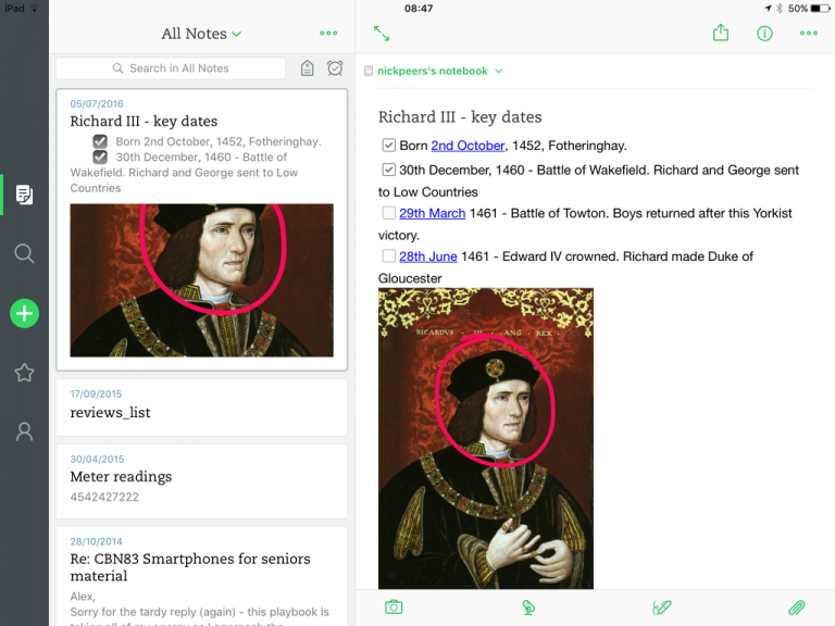
 If this were a TV show or movie franchise it would be a reboot. After a period of behind-the-scenes consolidation and soul-searching, Evernote Corporation has signaled a new approach to its note-taking tool with the release of Evernote for iOS 8.0 .
Version 8.0 sees the cluttered green interface of yesteryear banished, replaced by a more minimalist design as Evernote attempts to reposition its note-taking app with speed and user-friendliness at its core.
The most obvious change is the simpler user interface. The home screen has been removed so users begin at the recent notes screen. There are now just five icons on the left giving users easy access to notes, search, shortcuts and account settings, plus a handy one-tap button for creating a new note from scratch.
The one-tap create button works two ways — a short tap opens a new text note, or users can tap and hold to bring up a pop-up giving options for creating audio, photo or reminder-based notes.
Домой
United States
USA — software Evernote for iOS ushers in new streamlined era for note-taking tool


