Apple’s iOS 14 reveal at WWDC offers hints about the next iPhone’s screen size, audio, AR features and more.
We got a first look at iOS 14 at the WWDC keynote. This next version of Apple’s iPhone operating system will make its debut when the iPhone 12 handsets are officially announced later this year.
Apple knows what it’s doing – a quick peek at iOS 14 was never suddenly going to tell us everything we want to know about the iPhone 12. But a few of the new features do point to some hardware advances that have been rumored, and perhaps the odd change that hasn’t.
We’ve dug through the words of Tim Cook, Craig Federighi and others to see what iOS 14 really means for the next set of iPhones – and despite the rolling waves of catastrophe 2020 has brought, we still expect to see those phones around September this year.
During the WWDC 2020 keynote, Craig Federighi sold us the new complexity of iOS 14 as simplicity.
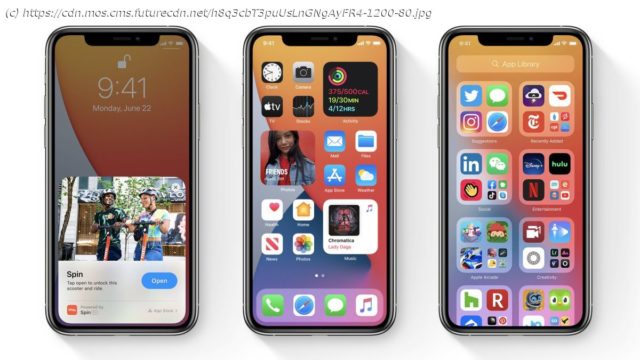
Siri will no longer take up the whole screen, but conjure contextual overlays depending on what you ask for. App Clips are mini applets that pop up on part of the screen when you scan a code or pass your phone over an NFC tag. And, most important of all, multi-size widgets can now sit on any home screen.
iPhone widgets are now much more like Android ones – but fewer Android fans seem to like them now than they did in 2012. Why? Few are as useful as the simple app icons that could use that same space.
Asking more of the screen space supports the rumors that Apple will increase the screen size of its larger iPhone 12 models – let’s call them the iPhone 12 Pro and iPhone 12 Pro Max.
As the current iPhone 11 models still have fairly significant bezels around the screen, we expect the display on the new handsets to push further into the sides of the phone.
Apple may also choose to bump the iPhone 12 Pro Max up to display five columns of app icons, which in turn will give the phone more room for widgets without making you get rid of almost all of your app icons.
Right now, all iPhones from the iPhone SE up to the iPhone 11 Pro Max use four app columns, and this may start to look regressive in a phone with an even larger display, and which can make greater use of the space when iOS 14 lands.


