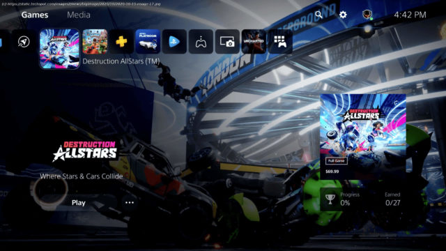
On Thursday, Sony’s State of Play gave users a glimpse of the new user interface and experience on the PlayStation 5 (above). As a brief first look…
On Thursday, Sony’s State of Play gave users a glimpse of the new user interface and experience on the PlayStation 5 (above). As a brief first look at the new UX, Sony avoided the deep dive. Instead, it provided a quick overview of some of the interface highlights, including a remodeled XrossMediaBar (pronounced: cross media bar), parties, and the new navigation feature it calls «Cards.» Right off the bat, you can tell the UI is entirely different from any previous PlayStation model. Instead of a XrossMediaBar (XMB) that takes up the entire screen as it does on the PS4 and PS3, the PlayStation 5’s XMB is smaller and is oriented more to the upper left of the home screen (above). Other than its size and location, it still looks like Sony’s traditional XMB with icons for games, library, capture gallery, the PlayStation Store, and the rest of what users have come to expect. However, Sony’s Sid Shuman noted that users would spend much less time on the XMB, thanks to «Cards.» Cards are boxes that you can pull up at any time, even right in the middle of your game, to perform various functions.
Домой
United States
USA — software Here's your first look at PlayStation 5's new user interface rebuilt from...


