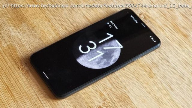
Google announced the first public beta of Android 12 on 18 May and we’ve been testing out everything it has to offer, as well as learning what’s still to come
As well as giving us our first official look at Android 12, Google I/O 2021 also marked the rollout for the first public beta of the company’s next mobile OS release; a beta that we’ve since downloaded onto a Pixel 5 to road test for you. If you want to download the May Android 12 beta release for yourself, make sure you have a compatible device and head on over to our ‘How to download Android 12 Beta’ article, for a comprehensive walkthrough. In Google’s own words, Android 12 centres around » a new UI that adapts to you, improving performance, with privacy and security at the core.» While privacy and security enhancements are always appreciated, the new user interface — dubbed ‘Material You’ — is easily the most prominent shift compared to Android 11, and probably one of the most substantial visual overhauls to Android across the last few generations. After three developer previews, this May update serves as the first of four public betas marked on Google’s roadmap to Android 12’s official release (expected September 2021, alongside the Pixel 6) and as such, doesn’t pack in all the features promised as part of I/O 2021, more will follow. Once downloaded and installed (on the Pixel 5 we were using to test beta 1, the download clocked in at 1.88GB), the first thing you’ll encounter is the new lock screen and lock screen clock. Material You manifests in a number of ways, from new rounded UI elements to richer interaction animations. If you use the Pixel’s always-on display function, you’ll notice that — provided you don’t have any unread notifications — the clock sits front and centre. Waking the device pushes the font used by the clock to transition from fine to bold, and hints at what to expect from the rest of this new Material You-driven experience. Google has seen fit to allow UI elements to take up far more room on-screen than on previous builds of Android, meaning information — be it icons or text — has a little more room to breathe, at the expense of being able to display as many disparate pieces of information (without scrolling or swiping to reveal more). Rounded corners feature on elements like the apps drawer, certain widgets, notifications, quick settings, apps in the multitasking view and beyond. Notifications of similar types form rounded rectangle blocks, with the radius of the corners increasing should you break out a notification from a block (such as when swiping to dismiss one).
Домой
United States
USA — software Everything Android 12 Beta 1 does (and doesn’t) bring to the table


