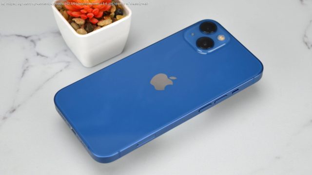
The iPhone 13 may seem iterative compared to the iPhone 12, but under the hood, it’s anything but. Read our iPhone 13 review to find out why.
I’m far from the first to say it, but on its surface, the iPhone 13 and 13 Mini definitely feel like “S” years. That’s to say, Apple has taken the iPhone 12 from last year, and refined it a little. But dig a little deeper, and your opinion about the importance of the changes this year might shift. While last year’s changes were mostly related to design, this year’s heavily impact the day-to-day. In my book, that’s what matters. The improvements are meaningful too. The iPhone 13 offers a longer battery life that should easily get most through a full day. And the camera improvements cement the iPhone 13 as offering a better camera than any of the competition. The iPhone 13 doesn’t quite reach the heights of the iPhone 13 Pro though. Does that really matter? I’ve been using the phone to find out. The overall look and feel of the iPhone 13 is pretty similar to last year’s iPhone 12. You’ll get the same squared-off edges and the same Lightning port on the bottom. The device is slightly thicker and heavier, but you won’t really notice. The fact that the design is so similar isn’t a bad thing. The iPhone 13 looks great. It’s got nice, glossy glass on the back, with a matte frame around the edges, and it’s available in a variety of great colors. We’re reviewing the Blue model, which is similar to last year’s blue and looks awesome. There are a few design changes, though they don’t really make much of an impact on day-to-day life. Because the camera sensors are a little larger, Apple has had to rearrange the camera module a little — so the cameras are now diagonally aligned instead of vertically aligned. The cameras also protrude a little more from the back of the phone. Perhaps more important is the fact that the notch is a little smaller. You’ll notice it if you really look hard, but it has almost no impact on daily life. Hopefully, Apple will find a way to eliminate the notch altogether relatively soon. The iPhone 13 feels great in the hand, though depending on how big your hands are that may change for you. I have relatively large hands and have no issue reaching the opposite side of the device when typing, though I normally swipe when using one hand. Those with smaller hands may want to consider the smaller iPhone 13 Mini. The iPhone 13 Pro got a major display upgrade with the addition of ProMotion. Unfortunately, the tech didn’t make it to the standard iPhone 13 though. In other words, the display on the iPhone 13 and 13 Mini is similar to last year. That doesn’t mean the display is sub-par though. On the contrary, the display on the iPhone 13 still looks great. For the iPhone 12, Apple finally switched to OLED tech for its non-Pro devices, and you’ll still get that this time around. That means deeper black levels and higher contrast, not to mention better power efficiency. The 6.1-inch size is definitely big enough for most, though I’m excited at the rumors that Apple may ditch the Mini next year in favor of an “iPhone 14 Max.” The screen gets more than bright enough for most. It reaches a peak brightness of 1200 nits, with a typical brightness of 800 nits. That’s up from a little over 600 nits on the iPhone 12. It’s easy to see the iPhone 13’s display in even direct sunlight, which is very helpful. Still, as someone who’s using the iPhone 13 Pro at the same time as the iPhone 13, I can’t wait for Apple to bring ProMotion to its lower-end iPhones.


