A dreamy MacBook—but amping up the M1 is not for everyone
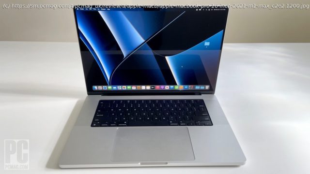
It’s been a long wait, but this fall Apple’s flagship 16-inch MacBook Pro finally gets the Apple M1 silicon treatment. In addition to ditching Intel processors for Cupertino’s own M1 Pro and M1 Max, the biggest of the MacBook Pros gains more input/output ports and a gorgeous new XDR display. Just as its predecessor did, the new laptop holds its own against Windows mobile workstations. But the latest 16-inch MacBook Pro (starts at $2,499; $4,299 as tested) isn’t so much more powerful or capable than its competitors—or its new 14-inch little sibling —in conventional CPU metrics that every pro user will be able to justify its high cost. This model is all about the specialized usage cases of macOS-bound content pros for whom processing times are money, writ large. The Big MacBook Pro Goes M1 The base-configuration 16-inch MacBook Pro is $100 more expensive than its predecessor, and prices increase steeply when you add the M1 Max processor option along with the extraordinary amounts of memory (up to 64GB!) and storage (up to 8TB!) that Apple offers. What’s more, nearly all of the standard and optional features of the 16-inch MacBook Pro are also available on the smaller 14-inch model at lower prices. So your choice really comes down to size, weight, and price. If you can stomach spending a lot of extra dough and carrying around a significantly bulkier and heavier chassis for two additional inches of screen real estate, the 16-incher is a no-brainer. But if you’re like many pros looking for a blend of portability and power, we suspect that these compromises might turn you off, especially if you’ve already got an external monitor at home or the office to do most of your multitasking and other tasks that require big screens. That’s why we’re giving the 14-inch model an Editors’ Choice award, but not the 16-inch version reviewed here. Some of you may find the opposite to be true, in which case you’re in the right place. Everyone else should head over to our analysis of the 14-inch MacBook Pro to see why we think it’s a better option. If you’re still interested in the 16-inch model, let’s continue the review by taking a closer look at the few differences that do exist between it and its little sibling, starting with the obvious one: size. The 16-inch MacBook Pro measures 0.66 by 14 by 9.8 inches (HWD) and weighs 4.8 pounds. That’s up slightly from the 0.64-inch thickness and 4.3-pound weight of its predecessor, but this isn’t a machine that’s intended to be carried around all day with you wherever you go. If you’re upgrading, you probably won’t notice the difference during occasional trips from your desk to the conference room or between rooms of your home. The laptop feels hefty and substantial—this is not an ultraportable laptop, by any means. (We usually define that category of laptops as weighing 3 pounds or less and measuring less than 0.6 inch thick.) The 14-inch MacBook Pro isn’t technically ultraportable either, but it’s markedly easier to carry around, at 0.61 by 12.3 by 8.7 inches and 3.5 pounds. Apart from the size differences, the 16-inch and 14-inch MacBook Pros share most of their other physical features, from ports to keyboards to the XDR screen tech to the choice between M1 Pro and M1 Max processors. Even the new camera notch in the top portion of the screen, which was absent on the previous 16-inch model, is present on both of the new laptops. Both also offer your choice of Space Gray or silver color schemes, following in the footsteps of countless Apple products of yesteryear. While you might assume that performance differs between the two, since the larger laptop naturally has a more capable thermal management system to keep the M1 Pro or M1 Max chips running at their maximum potential, that actually turns out not to be the case for most of the workflows everyday Mac users are likely to perform. So let’s save talk of performance for the end of this review, and instead take a closer look at what else the 16-inch MacBook Pro has to offer. The New Port Mix: Old Favorites, New Options It’s not often that input and output ports become a headlining feature on a laptop, but it’s certainly the case with the new MacBook Pro. Five years ago, Apple ditched most of the ports on its laptops, doubling down on USB-C/Thunderbolt. The internet complained endlessly, with reviewers and commenters complaining that laptops need more than just one type of port. Yet Apple persisted…until this generation of Pro. Of course, USB-C is versatile, depending on how it is implemented; it can do battery charging, display output, even 40GBps Thunderbolt transfers to external drives. But professional users with complicated setups of peripherals simply need more I/O variety, and Apple has restored that variety with the new MacBook Pro. A dedicated HDMI output is back, for connecting external monitors without an adapter cable or dongle, and the SD card reader also makes a welcome reappearance. Apple once claimed that sticking an SD card reader into your laptop is an inelegant solution for transferring photos and video, but professional photographers I know decry this sacrifice of function at the altar of form. It’s nice to see the slot back. The MagSafe power connector (now dubbed «MagSafe 3») is the final port making its reappearance on the new MacBook Pro, offering a dedicated power connector that’s a cinch to attach. (Magnets guide it into place.) The new connector isn’t compatible with previous MacBook MagSafe adapters, and it is not compatible with MagSafe accessories for the iPhone and iPad. But it does offer the dual advantages of cleanly breaking away if you happen to trip over the cord, as well as not taking up a Thunderbolt connector to charge the battery. The latter isn’t as generous an improvement as it otherwise might have been, since the new laptop includes three USB-C/Thunderbolt ports instead of the four on the previous model. But at least all of them support Thunderbolt 4, the latest rev of the Thunderbolt interface. There’s also a 3.5mm audio jack—it’s nice to see that Apple so far hasn’t ditched this endangered port like some of its competitors have. A Farewell to Touch Bars To many Apple users’ chagrin, the 2016-to-2020 MacBook Pros lacked physical connections, and they piled on the controversy with a unique touch-screen interface known as the Touch Bar. A thin strip of touch-enabled screen that replaces the row of function keys on the keyboard, the Touch Bar is a controversial means of adding touch capabilities to macOS, which has never been redesigned for comprehensive onscreen touch support in the way Windows has been. Apple touted the Touch Bar as a boon to creative pros, who could use it to scrub through video timelines and quickly access the settings they needed to adjust for any given task. It certainly had its adherents. But many people found the Touch Bar gimmicky, and not a proper alternative to adding touch support to the main display. Apple has apparently had a change of heart, and removed the Touch Bar from the 2021 MacBook Pro 16-incher. (The previous version came with a Touch Bar by default, while the 13-inch MacBook Pro could be ordered with or without one, depending on the configuration you selected.) In the Touch Bar’s place on the 2021 MacBook Pro, you’ll find the row of familiar conventional function keys, including brightness and volume controls, as well as buttons to activate Spotlight search and Mission Control. Programmers may especially welcome the return of the full-size, physical Escape key, which can be useful when you’re compiling code. In the upper left corner, there’s a power button with a built-in Touch ID sensor for fingerprint logins to your macOS account. The rest of the keyboard and the Force Touch trackpad are essentially unchanged from the same excellent ones that grace the previous edition of the 16-inch MacBook Pro, and that are currently found on the 13-inch model. The Magic Keyboard offers sturdy keys with plenty of travel distance and extremely sturdy switches, and it uses an ambient light sensor to automatically adjust backlight intensity. The trackpad on the 16-inch model maintains its enormous size—it’s far larger than the one on the new 14-inch MacBook Pro. It has generous proportions and offers a uniform clicking sensation thanks to haptic feedback, no matter where your fingertip is located.


