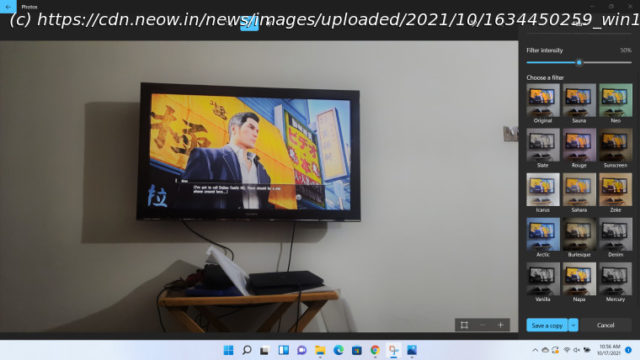
News, Reviews & Betas which includes large community peer support Microsoft has revamped the Photos app for Windows 11 with new icons and redesigned menus. More importantly, there is almost nothing new apart from that, so Windows 10 users aren’t missing out.
Windows 11’s general rollout began a couple of weeks ago ( check out our review here), but since it’s a staggered release, not everyone got access to it on day one. While there are ways to trigger the update immediately, it’s worth knowing what’s in store before you decide to do so. This is why we have been discussing Windows 11’s new features and capabilities in our ongoing Closer Look series for the past couple of months. So far, we have taken a look at Search, Widgets, the Start menu, Snap Layouts and Snap Groups, the Taskbar, quick settings and notifications, Virtual Desktops, power and battery settings, default apps configurations, File Explorer, context menus, Teams integration, the updated Clock app in Windows 11, the Microsoft Store, the Snipping Tool, the Paint app refresh, and the lock screen. Today, we’ll be discussing the updated Photos app available in Windows 11. For the purpose of this hands-on, we’ll be taking a look at the generally available Windows 11 build versus a publicly available and up-to-date Windows 10 (version 21H1 build 19043.1288). As usual, we’ll start off with what’s available presently in Windows 10. I’ll be honest and say right off the bat that the Photos app is not part of my usual workflow. Image editing or even taking photos is not something I do on a daily basis, and the Photos app has been so slow and crash-prone in my previous brief experiences with it that I actually dread scenarios where I’m forced to use it. When you launch the Photos app, you’ll see the Collections page where you’ll see some groupings of photos at the top and images in chronological order in the bottom half of the screen. It can appear fairly cluttered but shows a decent amount of information. There are other tabs available too such as Albums, People, Folders, and Video Editor. Folders are essentially pointers to directories in Windows where you store images, while Albums are groupings of similar images based on date or anything else, really. You can add new Folders and Albums fairly easily too. The People tab is where you can utilize Microsoft’s AI technology to automatically detect faces in images and group them together, but if you’re privacy-conscious, you can simply choose not to enable it. That is the default configuration too. There is also a search bar at the top-center through which you can search for specific images, provided that you use decent keywords. Before we go to the Video Editor tab, let’s first wrap up the images section by talking about the image-editing experience. When you click on any image in the Photos app, it opens up in a dedicated window showing you some basic options such as zoom, delete, crop, rotate, share, and print. There are also a bunch of other options in the three-dotted menu on the far-right corner including a slideshow, file info, resize, set as desktop wallpaper, and more. But if all of this is not enough for you, there is also a dedicated Edit & Create drop-down that gives you some relatively advanced editing options including Edit, Draw, Add 3D effects, Add animated text, Create a video with music, and Edit with Paint 3D. All of the aforementioned options provide what I would call an adequate set of image-editing capabilities. You’ll see all the usual stuff including filters, lighting adjustments, drawing, effects from Microsoft’s 3D library, fancy texts, integration with Paint 3D, and video editor. It’s not meant for advanced users or professional users but it might scratch the Instagram bug in you if you’re into that sort of stuff. Photos also has a basic video editor built-in. You can either use your existing photos to create a video project or start a new one from scratch.


