Just one big GUI mess
Opinion The sight of a former executive laying into their old company is rarely less than delicious. And when that company is Microsoft, the exec is head of user experience, and the complaint is about the solid slab of sadness that is the Windows 11 Start menu? This calls for not just regular salted popcorn, but truffle-oil popcorn on a silver platter carried in by a butler.
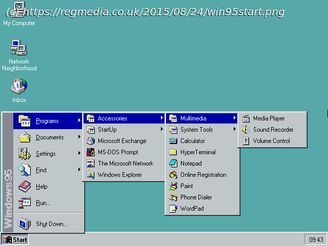
Yet ex-Rex of UX Jensen Harris, who also confesses to being the murderer of the Windows startup sound, is, if anything, far too sparing in his regal condemnations. In the 20 years since the Start menu first appeared, it has changed many times, but arguably to little user benefit. It isn’t hard to find videos of youngsters barely older than the button reacting with growing pleasure as they click around the Windows 95 desktop.
That’s because the desktop metaphor was basically done. By the time it came out, Windows 95 was the beneficiary of 20 years of evolution in graphical user interfaces, first introduced in the Xerox Alto of 1973. That supplemented – but did not replace – the text terminal, which would be familiar to teletype operators of the 1920s. Teletypes themselves were inheritors of the QWERTY keyboard of 1873. Some 150 years later, as you compose your emails or write your jeremiad against Windows, that’s basically what you’re using. Stability in UX is not a bad thing.
Constantly messing around with UX is a bad thing, however. All you need is for it to find resources, start software, control your computer, and arrange things to your liking.


