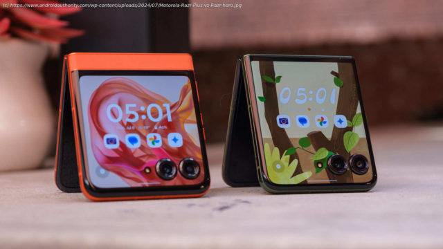
Bigger doesn’t always mean better, especially when you can save $300. Here’s why the Motorola Razr might be the best flip phone to buy.
Affiliate links on Android Authority may earn us a commission. Learn more.
Published on21 minutes agoMotorola Razr Plus (2024)Motorola Razr Plus (2024)
Motorola created my favorite flip-style foldable phone to date when it introduced the Razr Plus in 2023. Not because there was anything earth-shatteringly wrong with Samsung’s previous Galaxy Z Flips or even Motorola’s older Razrs, but because the Razr Plus made its cover screen feel like a feature rather than an extra. It became possible to trust a 3.6-inch display for everything I needed throughout the day and trust it I did. Sure, there were flaws with the $1,000 flip phone, but the overall experience was good enough to make me look forward to the next time I could say “Hello, Moto” to something other than a cheap Moto G device.
Now that time has come, I’m torn — in a good way. The Motorola Razr Plus (2024) has arrived, and it’s a great phone, but I find myself falling harder for the more affordable Motorola Razr (2024). Here’s why I feel that way and whether or not my feelings are strong enough for me to close the Razr Plus for the year.Cover (screen) me up
Last year, the larger cover screen was one of the main reasons I loved the Razr Plus. For the 2024 models, it’s a case of extra real estate all around, and it works heavily in the base Razr’s favor. While the more premium Razr Plus picked up a slightly larger external display, rising from 3.6 to an even four inches, the more affordable model more than doubled its size, jumping from 1.5 inches to 3.6 — nearly picking up the same panel I enjoyed on the previous generation.
However, I think some differences between the two benefit the newer Razr. For starters, Motorola dropped the refresh rate from 144Hz down to 90Hz, which still feels fast on a small, square display — not to mention being gentler on the battery life. It’s not all about downgrades, though, as the new panel is much brighter than before, topping out at 1,700 nits of peak brightness instead of 1,100. The change makes the Razr (2024) much easier to see in bright daylight than the Razr Plus (2023), and that’s without considering the new Razr Plus (2024), which has a variable 165Hz refresh rate and blinding 2,400 nits of peak brightness — both of which are impressive but might be overkill on a 4-inch display.
Surprisingly, I also prefer the Razr’s (2024) smaller display from a safety perspective. Although both models use similar panels of Gorilla Glass Victus, the protective strip of vegan leather near the base Razr’s hinge helps me believe it would be a bit safer should it tumble out of my hand. The soft textured panel gives me a place to grab the Razr without smearing fingerprints over the external display, which is always welcome.
Of course, just as important as the size and specs of the new cover screen is how Motorola chooses to use it. If you experienced the Razr (2023), you probably remember that its cover display wasn’t good for much beyond simply checking your notifications and offering a tiny camera preview, while the Razr Plus offered all the bells and whistles like opening apps and playing games. Now, both Razrs are created equal — down to the last widget and game.
Even better than that, Motorola has improved some of the best widgets from the previous Razr Plus, including revamping Spotify. Previously, the cover screen streaming experience offered little more than basic controls and a few of your most recent playlists to jump back into. Now, Spotify can stretch further across the cover screen, offering access to eight recently played podcasts, playlists, and albums. I’d still like to see Motorola add a way to search your Spotify library without opening your phone, but this is a good start for now.
It’s not all fun and games yet, as some apps still struggle to make sense of the camera cutouts that dot both home screens — more on those in a second. Google Maps, for example, still forces you to choose between directions that are easy to read and the ability to see a tiny sliver of the map. There’s no way to swap to an all-map view with occasional instructions popping in from the top edge, like what Apple does with its Dynamic Island. Google’s Gemini assistant tends to struggle, too, as its text responses are largely tied to the keyboard, so if you minimize the keyboard, you minimize being able to read the text, too.


