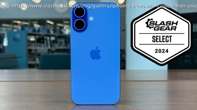
Apple’s iPhone 16 delivers pretty much everything the Pro models do for a slightly lower price — so what’s the difference?
For years now I’ve always owned some version of the latest-in-line iPhone Pro. In order to write intelligently about the product that over half the United States uses, I need to use it and understand it. I’ve always used the Pro model because it represented the best of what Apple had to offer, and that’s what I wanted to know about. If I wanted the full collection of features on the most capable piece of hardware, I got the Pro model.
This year is different. The iPhone 16 and 16 Plus have both caught up to the pro models in most meaningful ways. Dynamic island? Check. Action button? Bingo. Camera Control? You betcha. The only things missing from the not-pro iPhone are Always on Display and a telephoto camera — mostly (more on that later). So, I figured it was time to give the not-pro iPhone model a shot. Almost everything you want from and iPhone 16 Pro, you can find in an iPhone 16, so in my humble opinion, its time has come. I’ve been using the iPhone 16 for just over a week, and this is my full review.Hardware upgrades across the board
When you consider how many ways there are to upgrade a phone, it’s pretty remarkable that Apple touched on basically all of them. Never mind the two additional buttons that Apple added to the phone — Apple upped the ante on just about everything else. The battery is bigger. It has more RAM. It upgraded the processor by two generations. Apple made the phone lighter — yes, it is only 1 gram lighter, but that still counts!
Apple even made MagSafe charging faster by adopting the Qi2 standard. Now the iPhone can wirelessly charge at 25W rather than 15W. Apple did all that while keeping the same price from one generation to the next, unlike more than one other company releasing phones each year with prices creeping ever-higher.
This is more than just an iterative update. Apple brought real value to its most basic offering this fall, and that’s enough to get anyone excited.Stay in Control
Speaking of those extra buttons, the iPhone 16 and iPhone 16 Plus both gain the same new feature as the iPhone 16 Pro and iPhone 16 Pro Max. Camera control is a new button that Apple added to all four iPhones which is geared toward creators, and it’s important to note that when I say «creators» I don’t mean that with a capital «C.» Anyone who regularly snaps photos and shoots videos falls into the «creator» category, and let’s face it — that’s mostly everyone.
Semantics aside, Camera Control is a capacitive button that recognizes taps, slides, half-presses and full presses of the button, and every one of those does something different. The key benefit to Camera Control is you can just press the button to launch the camera. This is something many phones have done over the years, and it’s always welcome. I found myself using Camera Control to launch the camera basically any time I wanted to take a photo.Switching Lenses
Camera Control can get into some of the finer controls of the camera. It works either in portrait or landscape orientation, but it works much better in the latter. If you put some pressure on the button (without actually depressing it) you can start adjusting the selected control — I have mine set to camera lenses, switching between ultrawide, main, and zoom. If you double half-press, you open and can scroll between the various controls themselves. For example, you can switch from adjusting the zoom level to the depth of field settings, etc.
To move between those settings, you slide your finger across the button. It can be a little inexact at times. When I began using the Camera Control, I had it set to adjust the zoom level, and switching between 1x and 2x with all the other levels in between (1.1x – 1.9x) could get a little tricky, which is why I was glad to find that I had the option of simply switching between sensors.
It’s worth mentioning that most phone cases — including the one I used the most — have a cutout for this button. Spigen sent me its Ultrahybrid T case for the iPhone 16 Pro Max which adds a capacitive button of its own to the case. The cutout for the Camera Control lacks the level of precision that I wanted to get the button to work. Spigen’s case makes a big difference. It’s an easy recommendation, but unfortunately, it’s only available for the Pro and Pro Max.Action, not words
Also new to the non-pro versions of the iPhone is the Action button. This is the same button that came on the iPhone 15 Pro and iPhone 15 Pro Max last year, but it has a few new tricks up its sleeve. Like last year, you can program the Action button to do just about anything you want, and the whole thing is set by a nifty navigation UI that is unlike anything else in the operating system.
This year, the Action button gets some neat customizations which allow you to change the function of the Action button based on your focus mode. I don’t use focus modes much because I get severe FOMO when I switch into a work focus, but I use bedtime mode, so that could be handy if I wanted a flashlight overnight and something else during the day.


![Drony nad Polską. Oto kiedy naruszały naszą przestrzeń powietrzną? [KALENDARIUM]](http://nhub.news/wp-content/uploads/2025/09/thumbb0c02e8630e5456d5896703b98be9600-100x75.jpeg)
