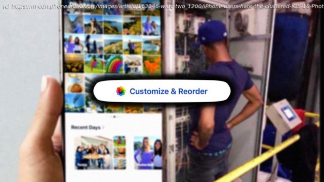
iPhone users seem to HATE the messy iOS 18 Photos app but you can fix it in just two steps.
I’ve always loved how simple and intuitive Apple’s Photos app is. It’s not that the iPhone’s Photos app is anything “special” — it’s just always been easier to navigate for me especially compared to the Google Photos app on my Pixel, which can be a pain — random backup pop-ups, having to exit an album to see newly added photos, etc.
However, with the new iOS 18 update, my experience of using the iPhone’s Photos app has changed — and not for the better. It’s something I noticed the moment I installed the iOS 18 beta on my iPhone 15 Pro Max, but we now come to see that this design was here to stay.
Sure, the iOS 18 Photos app looks more “modern” now, but in my opinion, it’s become cluttered and much harder to use. And what’s even more telling is the fact that the new iOS 18 Photos app seems to be universally disliked by almost every iPhone user.
Seriously, I’m struggling to think of a recent iOS update that made so many people unite under one opinion.
But here’s a bit more…
The iOS 18 Photos app is stuffed with random “albums” no one cares about — iPhone users hate it
One of my biggest gripes with the new iOS 18 Photos app is the overwhelming number of “albums.” I get it — Apple is trying to help organize your photos and whatever, but it feels like they’ve gone way overboard.
When you open the iOS 18 Photos app, you’re greeted with a million different album categories like Recent Days, People, Pinned Collections, Memories, Trips (which, by the way, is just sitting empty for me), Featured Photos, Shared Albums, Wallpaper Suggestions, and finally, at the BOTTOM of the app — the actual “Albums” folder.
It’s like Apple wants to remind me of every category they’ve ever come up with, instead of just letting me view my photos normally. And honestly, why is the «Albums» album (like the one I actually care about) sitting at the very bottom? Who designed this?
Cluttered iOS 18 Photos app proves Apple is running away from the simplicity iPhone users are used to
iPhone Photos app search bar size and position — iOS 18 vs iOS 17.


