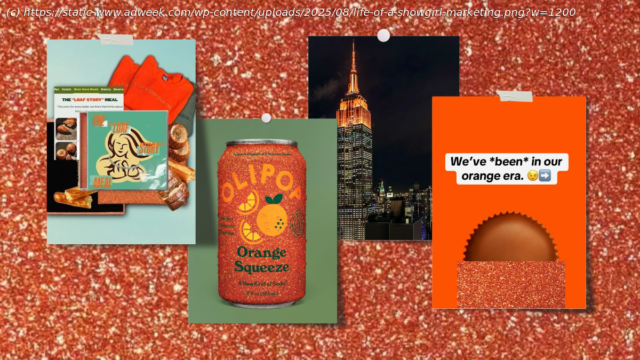
Panera and Reese’s are among the brands embedding themselves in Swiftie lore.
First there was Barbie Pink, then came Brat Green. Now, with the reveal of Taylor Swift’s The Life of a Showgirl cover art, the world is about to turn “TS12 Orange.”
The orange-and-turquoise color scheme from the artist’s 12th studio album (known among fans—or ‘Swifties’—as TS12) isn’t slated for release until October 3, but it’s already taken over brands’ social feeds and promotions.
In the seven days since the announcement, the Empire State Building has been illuminated in orange. On X, McLaren nodded to the similarity between Swift’s new aesthetic and its livery shade. Duolingo’s owl Duo and the Scrubdaddy Sponge each got a sparkly makeover, too, while other advertisers like Dunkin’, Shake Shack, United, and Olipop nodded to the color scheme on Instagram.
Like the bygone hues of Barbie and Charli XCX, the palette is quickly emerging as a new cultural currency for brands, providing them with a shortcut to relevance and buzz without the need for expensive, official tie-ins.
Since Swift debuted her latest project on her partner Travis Kelce’s “New Heights” podcast, brands have published 2,600 related posts on platforms including Instagram and X, according to data from social measurement tool Meltwater. Collectively, these have reached around 20 million people.
With a potential audience of 600 million, there’s plenty more room for brands to ride the TS‑12 orange wave.
However, the early winners aren’t just rethinking their logos; they’re embedding themselves in Swiftie lore to turn what could seem like an attention grab into something more meaningful.


