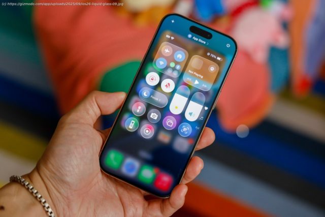
If you can’t get used Apple’s new liquidy and glass UI in iOS 26, there’s an option available for you.
Now that iOS 26 is available for everyone, iPhone users are breaking off into two camps. One is open to Apple’s new look for its entire product ecosystem, dubbed “Liquid Glass” for the translucent “glassmorphic” UI. As is so typical of the internet, the other side of the coin is livid about the change to their devices. Hold off on jumping the gun and retreating back to iOS 18. There are several hidden options that can make your device a little more legible and return the user interface to something more opaque, like on previous iPhone software.
Apple designed its Liquid Glass interface to appear layered, as if the buttons you’re tapping on the screen are tangible elements. The effect is as if a glass prism hangs over various design elements, where light refracts and distorts through app icons or menus. This can cause problems with legibility, especially when text in some menus distorts other words underneath it. Apple adjusted the transparency multiple times in beta over the last few months to arrive at the current version that’s less glassy and liquidy, but can still be a visual problem at times.
Apple had to deal with similar usability issues back in the age of iOS 7. The iPhone maker rolled out several updates that fixed performance issues and accessibility options to make text more readable.


