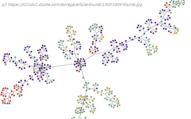
See how to use graph visualization and analysis to visualize the continually updated genomic epidemiology data provided by Nextstrain to reveal previously unseen coronavirus mutations.
Join the DZone community and get the full member experience. The internet has exploded with information about coronavirus and the disease it causes, COVID-19. The vast amount of data feels like too much to keep up with. But that’s where graph and data visualization thrives! So, we used the power of graph visualization and analysis to visualize the continually updated genomic epidemiology data provided by Nextstrain to reveal previously unseen coronavirus mutations. Phylogenetic data of coronavirus genomes and mutations from mid-March 2020 shown in symmetric layout using Tom Sawyer Perspectives To find a cure or develop a vaccine, researchers examine the RNA of the virus to figure out how it works, grows, develops, and changes. To do this, they break down the RNA to its smallest parts, identify each part, and then look for changes or relationships—like cracking a complicated code. Because genome sequencing uses a series of letters representing the chemical alphabet, viewing a genome sequence can be an eye-crossing affair. For example, this image is just a portion of an isolated genome of coronavirus (click here to view the full sequence): Snippet of an isolated genome of coronavirus from the National Center for Biotechnology Information When comparing one strain to another, researchers look for changes in the sequence. Mutations are identified any time a letter in the sequence changes, the exact way the coronavirus mutations are identified. Typically, virologists display this kind of data in a phylogenetic tree. Nextstrain has been integral in understanding the coronavirus mutations, spread, and geographical impact. It visualizes the data in a standard phylogenetic tree. Phylogeny graph showing genomic epidemiology of novel coronavirus from nextstrain.org Much like a genealogical or family tree, a phylogenetic tree shows how genetic matter evolves. It uses branches to show how individuals (or individual pieces of matter) relate to each other from one generation or mutation to the next. Node color indicates where that mutation was found. It seems simple, but the sheer volume of genomes and mutations can make for a very crowded phylogenetic tree.
Домой
United States
USA — software Coronavirus Mutations Revealed With Graph Visualization and Analysis


