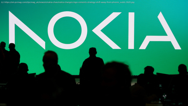
It’s the first overhaul of its branding and logo in nearly 60 years.
Nokia announced the first overhaul of its branding and logo in nearly 60 years.
The new logo comprises of five different shapes that form the word NOKIA, and it switches from the bold blue of its previous, widely recognized logo, to a range of colors depending on use.
The ex-mobile phone maker’s CEO Pekka Lundmark told Reuters that the rebrand was part of a conscious strategy to move away from being associated with smartphones, which the Finnish company hasn’t made for more than ten years. Lundmark said: “There was the association to smartphones and nowadays we are a business technology company.


